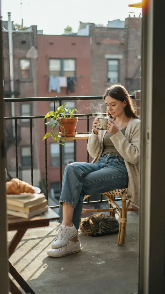
For dreamy aesthetic photo editing, you don’t need expensive presets or a high-end camera. In fact, the soft pastel tones that make images look like a gentle dream can be achieved right in the free mobile version of Lightroom. I have been editing on a budget for years, and I have learned that a few smart slider moves matter far more than any paid filter. In this Lightroom tutorial, I will show you exactly how to create that airy, film-like look using only the tools already in your pocket. Whether you are building an Instagram feed or just love experimenting with dreamy photography, these photo editing tips will help you get the result without spending a dime.
Lowering Contrast and Raising Shadows for a Soft Base
The foundation of any soft pastel edit is a flat, low contrast image. Start by opening your photo in Lightroom and heading to the Light panel. Pull the contrast slider down, usually between -20 and -40 depending on your starting image. This step removes harsh blacks and bright whites, making the photo feel gentle on the eyes.
Next, raise the shadows slider significantly. I often bump it up to +50 or even +70. This lifts the darker areas of the photo without blowing out the highlights. The goal is to create an even tonal range where nothing feels too heavy or crushed. Shadows that are too dark will ruin the dreamy vibe, so do not be shy here.
- Contrast: Reduce by 20-40 points for a flat base.
- Shadows: Increase by 50-70 to soften dark areas.
- Blacks: Raise slightly (around +10) to avoid muddy tones.
Remember that every photo is different. A well lit portrait needs less shadow lifting than a dim street scene. Trust your eyes, and keep the feel light and airy.
Using a Warm Tint and Desaturated Greens for a Pastel Color Palette
Once the exposure feels soft, it is time to shape the colors. A warm tint is essential for that cozy pastel palette. In the Color panel (or HSL section), shift the tint slider slightly toward the magenta or yellow side depending on the mood. I personally add a small yellow-green tint (around +5 to +10) to make skin tones look natural and golden.
Greens can be tricky because they often look too vibrant and clash with pastel dreams. Desaturating greens just a little makes the whole image more cohesive. In the HSL hue and saturation tabs, lower the green saturation by about -20 to -30. If there are yellow leaves or grass, you can also desaturate yellows slightly. The result is a muted, dusty palette that feels like a vintage photograph.
For a quick check, compare your edited version to the original. The colors should be noticeably less aggressive, almost like they have been washed in a soft sunlight.
Adjusting the Tone Curve for a Subtle Film Fade
The tone curve is where the magic happens for that film like fade. You do not need complex RGB curves either. Simply lift the bottom left point of the curve (the black point) just a tiny bit upward. This turns the deepest blacks into a dark gray, which mimics how film photographs look when they age or are printed on matte paper.
Then, bring the top right point (the white point) down a touch to reduce the brightest whites. The curve should look like a slight upward bend at the dark end and a slight downward bend at the light end. Think of it as creating an S shape, but a very subtle one. A little goes a long way, so start with a small
#aestheticphotoediting #softpasteltone #lightroomtutorial #dreamyphotography #photoeditingtips
Leave a Comment