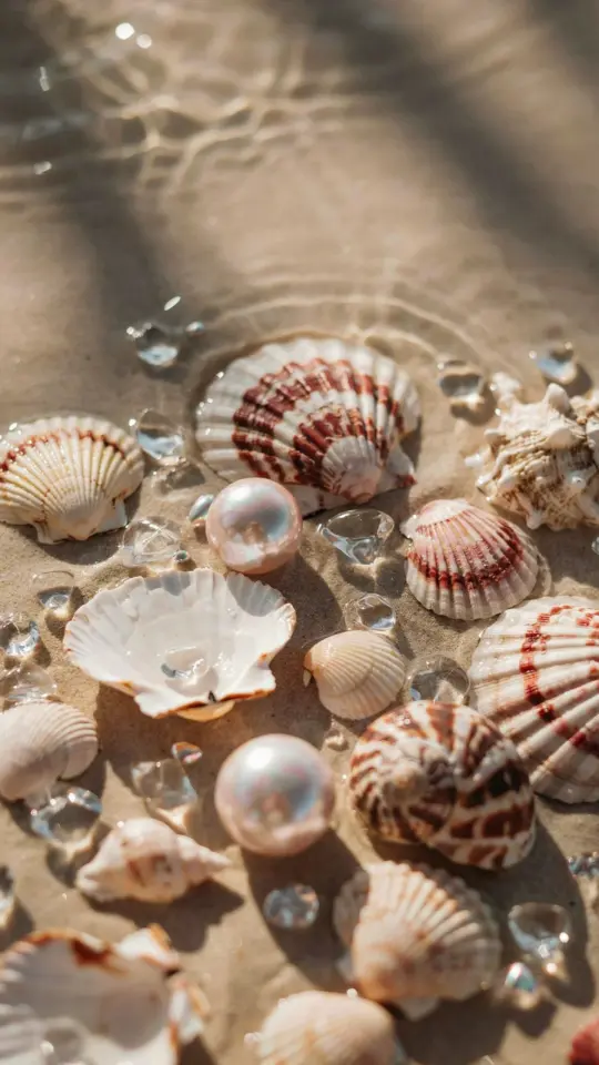
I remember the exact moment I fell in love with soft pastel tones. I was scrolling through my Instagram feed, feeling frustrated because my own photos looked flat and dull compared to the dreamy, cohesive grids I admired. That night I sat down with a cup of tea and my laptop, determined to crack the code. After hours of sliding sliders and comparing edits, I landed on a look that finally felt like me. This is the story of how I mastered aesthetic photo editing using Lightroom presets, and how you can steal the same method for your own images.
Why soft pastel tones make your feed look cohesive
Before I started editing with pastels, my photos were all over the place. One image had warm golden hour vibes, another was high contrast black and white. No matter how nice each shot was, my gallery felt messy. Soft pastel tones changed everything. By lifting the shadows, muting the highlights, and adding a gentle pink or lavender hue, every photo suddenly belonged together. Portraits, landscapes, even a random coffee cup shot all spoke the same visual language. That consistency is what turns a collection of photos into a recognizable style.
I found that pastel edits work especially well for images taken in overcast light or early morning. If you struggle with harsh midday sun, softening those tones can rescue a blown out sky or harsh shadows without looking fake. It’s not about making every photo look the same, it’s about creating a mood that ties your feed together.
My go to Lightroom settings for dreamy aesthetics
Here is the exact formula I use for almost every edit now. I work in Adobe Lightroom Classic, but these sliders exist in Lightroom Mobile too. The key is to start with the Basic panel and then fine tune with the Tone Curve.
- Exposure: +0.3 to +0.5 (bump it up just a little to brighten without blowing highlights)
- Contrast: -20 to -30 (softening contrast is the secret to that dreamy look)
- Highlights: -60 (pull them way down to tame any bright spots)
- Shadows: +50 to +70 (lift the shadows to reveal detail and create that floaty feel)
- Whites: -30 (avoid clipping)
- Blacks: +20 (keep a tiny bit of depth, don’t wash it out completely)
- Texture: +10 (just a touch to keep skin looking natural)
- Clarity: -15 (this softens the overall image, perfect for portraits)
- Vibrance: +15 (adds life without oversaturating)
- Saturation: -5 (sometimes less is more, especially if your scene is already colorful)
Those numbers give you a soft, airy base. From there I move to the Tone Curve for extra pastel magic. I lift the bottom left point of the curve (the shadows) up a bit, and then bring the top right point (highlights) down a tiny fraction. This creates a washed, matte effect that makes colors look like they were dusted with powdered sugar.
How to build your own Lightroom preset for pastel tones
Once I had a set of settings I liked, I saved them as a preset. That way I can apply the same look to every photo with one click, and then adjust individual photos if needed. To do this, just click the plus sign in the Presets panel in Lightroom, choose Create Preset, and uncheck things like spot removal and crop if you want only the tonal adjustments. I name mine something simple like “Soft Pastel Base” and add a little color label so I can find it fast.
I recommend creating at least two versions of your pastel preset. One for bright daylight and one for overcast or indoor shots. The bright version might have a slightly higher exposure and less shadow lift. The overcast version might need a touch more warmth in the White Balance. I learned this the hard way after applying the same preset to a cloudy forest shot and ending up with a gray mess. Now I have a pair of presets that cover most situations.
Editing portraits specifically for that dreamy look
Portraits are my favorite subject for pastel edits because the soft tones flatter skin and create a romantic, editorial feel. When I edit a portrait, I pay extra attention to the orange and yellow sliders in the HSL panel. I desaturate oranges slightly (around -15) and boost the luminance of oranges (about +15). This evens out skin tones and makes faces look naturally glowing without looking orange. For lips, I sometimes add a little red saturation back, but only +5.
If the background has green grass or trees, I also desaturate greens a bit and shift their hue toward yellow. That keeps the foliage from clashing with the pastel mood. I also add a radial filter over the subject’s face with a slight exposure boost ( +0.2 ) and a tiny warmth increase. It draws the eye in without being obvious. This method works for selfies, candid shots, and even group photos if you mask carefully.
Applying pastel tones to landscapes and nature photos
I used to think pastel edits only worked for portraits, but then I tried them on a photo of a misty mountain lake. The result was like a watercolor painting. For landscapes, I start with the same base settings but I often reduce the clarity even more (down to -25) to get that painterly vibe. I also increase the dehaze slider slightly ( +10 ) to cut through atmospheric haze without losing the softness. The sky can be tricky. If the blue is too intense, I lower the saturation of blues and aquas in the HSL panel, and I might shift the hue of blues toward cyan. That gives you a muted, vintage sky that pairs beautifully with pastel greens and browns.
One tip that changed my landscape editing: use the Graduated Filter to apply a separate pastel tone to the sky versus
#aestheticphotography #photoediting #lightroompresets #softedit #dreamyaesthetic
Leave a Comment