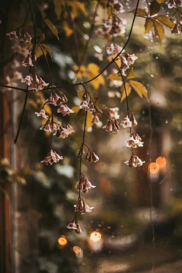
If you have been scrolling through Instagram this spring, you have probably noticed a shift toward softer, more muted imagery. The heavy contrast and oversaturated edits of a few years ago are giving way to something gentler. Soft pastel tones with a faint filmic quality now dominate feeds, especially for lifestyle, fashion, and travel content. This is where aesthetic photography editing comes into its own. It is not about applying a single filter and calling it done. It is about understanding how to shape light, color, and mood in Lightroom so your photos feel calm, cohesive, and genuinely beautiful without looking over-processed. I have been refining this approach for the past two seasons, and I want to share the exact steps I use to create those dreamy pastel tones that work perfectly for Instagram right now.
Why Soft Pastel Tones Work for Seasonal Aesthetic Photography
Soft pastel hues echo the lightness of spring and early summer. They feel airy, nostalgic, and a little romantic. When you reduce harsh contrast and lift shadows, your photos mimic the look of expired film stock, which has a natural softness that digital often lacks. This is not a new trend, but it keeps evolving. Right now, the most visually appealing feeds are not using full-on bleached whites. They are using off-whites, muted peaches, dusty lavenders, and barely-there blues. These colors work together because they share a low saturation profile. They do not fight for attention. That is the secret to a cohesive Instagram grid.
For aesthetic photography with a seasonal feel, start by shooting in soft natural light. Overcast days or golden hour produce the best base images because the light itself is already diffused. Then you take that raw file into Lightroom and gently steer it toward pastel territory. The goal is subtlety. You want people to notice the mood before they notice the edit.
The Foundation: Start with a Balanced Exposure
Before you touch any sliders for color or tone, get your exposure right. A common mistake when aiming for soft pastels is to underexpose and then try to fix everything in post. That leads to noise and muddy shadows. Instead, shoot slightly bright (overexpose by a third to half a stop if you are shooting in RAW). Then in Lightroom, bring the exposure back down just a touch. This gives you clean, noise-free shadows that will lift beautifully later.
- Set Exposure to where the brightest part of the image is just below clipping.
- Lower Highlights by 20-30 points to recover detail in bright areas (like a white dress or clouds).
- Raise Shadows by 30-50 points to open up darker areas without making them look flat.
- Watch your histogram so no channel is completely crushed.
This balanced foundation is the first real photo editing tip I give anyone new to pastel looks. Once your exposure is neutral, you can start shaping the personality of the image.
Adjusting Contrast and Shadows for That Faded Film Look
The faded film aesthetic relies on two key moves: reducing global contrast and lifting the black point. Many lightroom presets designed for film emulation do exactly this. You can achieve it manually in the Tone Curve panel. Bring the bottom-left point (the black point) up a little. This creates that “faded” look where true black is replaced by a dark grey. Then pull the white point down slightly so the highlights are not piercing. The result is a flat-looking image, but do not worry. You will add back dimension through color.
I also recommend using the Contrast slider, but go negative. Somewhere between -10 and -20 is usually enough. Then increase Clarity by a tiny amount (around +5) to preserve texture in hair or fabric. Do not overdo Dehaze; it adds a harshness that fights the soft tone you are after. Remember, the faded film look is about subtle imperfection, not zero information.
Adding a Subtle Teal Tint for Harmony
One of the most effective ways to unify a set of photos is to introduce a faint teal cast into the shadows. This is where instagram editing for aesthetic feeds often gets a bad name because it can look heavy-handed. The trick is to use the Color Grading tool (or Split Toning if you are on an older Lightroom version). Add a touch of teal (around hue 200-210) to the shadows with a low saturation value, maybe 5-10. Then add a tiny bit of warm peach or yellow to the highlights (hue 40-50, saturation 3
#aestheticphotography #photoeditingtips #lightroompresets #softtones #instagramediting
Leave a Comment