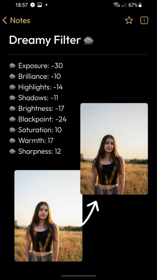
If you have been scrolling through travel photography feeds, you have probably noticed that dreamy blue tone look. It is cool, cinematic and feels like a calm morning by the water. Many photographers try to recreate it but end up with flat images or an unnatural blue cast. The secret is not just sliding the blue channel up. You need a thoughtful approach. That is why I put together this guide on Lightroom preset ideas for dreamy blue tones, along with a free mobile preset bundle that actually works. I have made plenty of mistakes myself, and I want to help you skip them.
How to Get Dreamy Blue Tones Without Oversaturating
One of the most common mistakes is cranking the saturation slider. You get a loud blue that overpowers everything. It looks fake and harsh. Instead, focus on the luminance and hue of the blue channel. Lowering the luminance a bit gives the sky a deeper, richer feel without making it pop unnaturally. Shift the hue slightly toward cyan, which feels softer than pure blue. I usually set the blue hue to around -5 or -10, then drop luminance by 10 to 20 points. That keeps the tone dreamy but still natural.
Another trick is to desaturate the blue just a little. You want mood, not a neon sign. If you are editing a beach scene, reduce the blue saturation by 10 percent and boost the aqua channel instead. This mimics the soft pastel blues you see in fog or early morning light. Your preset should lower contrast slightly in the blues to avoid that hard digital edge.
Best Mobile Presets for Travel Photography Blue Tones
Not all mobile presets handle blue tones well. The built-in presets in many apps push saturation too far. For travel photography, you want presets that are built around your camera sensor’s native colors. I prefer presets that adjust the tone curve first and then tweak individual colors. A good mobile preset will also include a white balance shift toward cooler temperatures, around 4500K to 4800K, but not colder than that or skin tones turn purple.
I always test a preset on three different photos: a sunny landscape, a portrait in the shade, and a low light city shot. If it works on all three, it is worth keeping. My free mobile preset bundle includes three variants that start with a cool base, then let you dial in warmth with the temperature slider. That way you always have control. Many presets lock you in and you cannot adjust them easily. That is a mistake you want to avoid.
- Test before you commit. Apply the preset and then check the histogram. Too much blue on the left side means crushed shadows.
- Use the point color tool. In Lightroom mobile, you can target specific blues and change their hue and saturation directly.
- Keep a backup. If you overdo the preset, reset the blue luminance under the color mixer.
- Don’t forget the gradient mask. For skylines, apply the preset to the whole image, then mask the sky and reduce blue saturation by another 5% to avoid blotchiness.
Common Mistakes When Editing Blue Tones in Lightroom
I see the same three errors over and over. First, people ignore the skin tone problem. When you push the whole image blue, faces look cold and unwell. The fix is simple: use the HSL panel to reduce the blue saturation in the orange and yellow channels. Those colors control skin tones. If your subject looks like a smurf, you need to bring back warmth selectively. I like to add a radial mask over the person and raise the temperature by 5 to 10 points.
Second mistake: neglecting the shadows. Blue tones can make shadows muddy and gray. Instead of letting them turn flat, lift the black point slightly and add a tiny bit of green or cyan to the shadows in the split toning panel. That keeps them rich and cool without losing detail. A shadow hue of 210 degrees (cyan-blue) with low saturation, around 5 to 8, works well.
Third mistake: using the same preset for every light condition. A preset made for golden hour will look terrible in overcast weather. I keep three versions of my dreamy blue preset: one for bright sun, one for overcast, and one for indoor or night shots. The free bundle I am sharing has those three variants already. It saves a lot of time.
Balancing Cool and Warm Tones for a Cinematic Look
The most cinematic images are not purely blue. They have a slight warm counterpoint somewhere, in the highlights, the sun flare or the subject’s clothing. Pure cool tones can feel sterile. That is why I always add a tiny bit of warmth to the highlights. In Lightroom, set the white balance to a Kelvin value around 5200K, then use the split toning tool: highlights at 40 degrees (orange) with 10 to 15 saturation, shadows at 220 degrees (blue) with 10 saturation. That gives you a teal and orange look without being aggressive.
If you photograph coastal landscapes, try warming the sand or rocks separately. Use a brush tool with a low exposure boost and a temperature shift of +15. The contrast between warm foreground and cool sky creates depth. That is the dreamy blue tone idea done right. Many presets miss this balance and end up looking like a single color filter. You want variety within the tone.
Choosing the Right Blue Hue for Outdoor Photos
Not every blue is
#LightroomPresets #BlueTones #PhotoEditing #MobilePresets #TravelPhotography
Leave a Comment