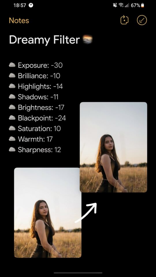
I have been through dozens of moody portrait edits over the years, and if there is one thing I have learned, it is that most Lightroom preset ideas for moody portrait editing fall apart because of the same few mistakes. You see the dreamy, cinematic look on Instagram, download a preset, slap it on your photo, and suddenly the skin looks green, the highlights are blown, or the whole image feels flat. It does not have to be that way. The secret is not in finding the perfect preset but in understanding where the common pitfalls hide and how to fix them yourself. This guide walks through the recurring errors I see (and have made) so you can build custom presets that actually work for moody portrait photography.
Why most moody presets destroy skin tones (and how to fix it)
The first mistake I notice with almost every off-the-shelf moody preset is the way it handles skin. The deep teal shadows and lifted blacks that make a background look moody often turn people into greenish-grey ghosts. I used to wonder why my subjects looked sick until I realized the preset was pulling the orange and yellow saturation down too aggressively.
To avoid this, use the HSL panel to protect skin tones. Lower the saturation of blue and aqua in the shadows, but keep orange and red luminance high. A quick trick: after applying your moody look, go to the color mixer and reduce the saturation of orange only slightly while increasing its luminance. This keeps the skin warm without fighting the overall moody vibe. Your custom preset should include a specific skin tone safeguard, not just a blanket curve adjustment.
Overcooking the blacks: the fine line between moody and muddy
When people think moody, they often drag the blacks slider way down or crush the shadows completely. The result is a photo that feels heavy and lacks depth. I have deleted countless edits that looked like someone spilled charcoal on the lens. Mood does not mean blackout.
Instead of pulling the blacks to zero, use the tone curve to create a subtle fade. Lift the very bottom-left point of the curve slightly and add a gentle S-shape. This keeps the blacks from being pure black while maintaining contrast in the mids. For portrait editing, you want the shadows to have detail, especially in hair and clothing. A good rule is to keep the RGB composite curve’s black point around 5-10 on the input scale, not zero.
How to avoid flat highlights that kill the mood
Moody portraits rely on soft, controlled highlights. One mistake is to drag the highlights slider all the way down, which makes the face look dull and gray. Another is to leave them too bright, which destroys the atmospheric feel. I struggled with this for months.
The fix is to use the highlight slider along with the white slider and a slight exposure bump. Bring highlights down to around -20 or -30, then raise the whites just a touch to +10 or +15. This keeps the brightest parts of the image from clipping but leaves a little sparkle in catchlights (the reflections in the eyes). For even more control, use the luminosity mask trick: hold the Alt key (Option on Mac) while dragging the highlight slider to see exactly which pixels are clipping. Adjust until only the tiniest specular highlights remain white.
One preset does not fit all: customizing for different lighting
A huge mistake beginners make is thinking they can apply the same moody preset to every photo in a session. I did this at first and ended up with a gallery where half the images looked teal and the other half looked mustard yellow. Lighting changes everything: golden hour, overcast sky, indoor tungsten, all react differently to the same color grades.
Build a base preset that handles the core moody look (curve, contrast, muted saturation) but leave the white balance and tint as default. Then, for each image, adjust temperature and tint first. For warm golden hour portraits, I drop the temperature slightly to cool the reds. For overcast shots, I warm it up a bit. This way you keep the moody aesthetic consistent while respecting the light. Save your base preset as a starting point, not a final answer.
The hidden problem of white balance in moody portraits
White balance seems simple, but in moody editing it can ruin the entire color story. I see many presets that lock in a strong blue or green tint in the highlights,
#LightroomPresets #PortraitEditing #MoodyPhotography #PresetIdeas #LightroomTips
Leave a Comment