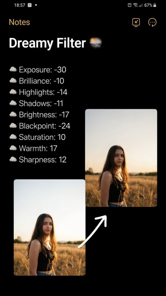
If you search for Lightroom preset ideas for moody portrait editing, you will find a flood of options promising cinematic tones with one click. I have tested dozens of them, from free downloads to expensive packs, and I keep running into the same problems: skin tones turn green, shadows become muddy, and the so-called moody look actually makes my subjects look sick. After years of trial and error, I realized the issue is rarely the preset itself. It is how we use it. This article is a no-nonsense guide to the most common mistakes photographers make when applying moody presets, and exactly how to fix them so your portraits keep their emotion without losing the person in the photo.
Mistake 1: Slapping a Preset on Every Photo Without Adjusting White Balance
The fastest way to ruin a moody portrait is to ignore the white balance sliders. Every lighting situation has a different color temperature. A preset tuned for golden hour sunlight will turn a cloudy day shot blue and cold. When you import your preset, always check the Temp and Tint sliders first. Move the Temp slider slightly warmer (toward yellow) if the skin looks greenish, or cooler if faces look orange. This one adjustment saves you from the dreaded “zombie skin” that moody presets often create. I learned this the hard way after ruining an entire family session because I trusted a preset’s default white balance.
Mistake 2: Pushing the Green and Teal Palette Too Far
A dark green and teal color palette can look incredible, but it is a tightrope. Many preset builders crank the hue sliders in the HSL panel to shift greens toward teal and blues toward cyan. That works fine for landscapes. For portraits, it often turns lips gray and makes eyes look hollow. The fix is simple: in the HSL panel, target only the background colors (greens, blues, aquas) and leave the Reds, Oranges, and Yellows alone. Pull down the Saturation of green and blue slightly, but never go below -20 on the Orange saturation, because that is what controls skin undertones. If you want that cinematic mood, keep the teal in the shadows and let the skin stay warm. Your subjects will thank you.
Mistake 3: Crushing Shadows Until Detail Disappears
Moody photography often relies on deep shadows to create drama, but there is a difference between moody and muddy. When you drag the Shadows slider too far left, you lose texture in hair, clothing, and the background. The portrait feels flat and heavy. Instead of crushing the whole shadow region, use the Tone Curve. Pull down the bottom-left point slightly to create a subtle fade or “lifted black” effect. Then back it off by raising the point just a touch. This keeps the mood without sacrificing detail. For a practical test: zoom into the subject’s hair. If you cannot see individual strands, your shadows are too dark. Raise them until the texture comes back, then add contrast with a gentle S-curve.
Mistake 4: Ignoring the Calibration Panel for Skin Tone Harmony
Most photographers edit in the Basic and HSL panels and never touch the Camera Calibration tab. That is a missed opportunity. The Calibration panel lets you shift the entire color structure of the image without messing up individual sliders. For a moody green-teal portrait, try this: set the Blue Primary Hue to around -15 and Saturation to +10. Then set the Green Primary Hue to +20 and Saturation to -10. This nudges greens toward teal and pulls blue shadows into a deeper cyan, while the Red Primary keeps skin tones honest. I stumbled on this trick when a client told me her skin looked “too green” after using a popular preset. One calibration tweak fixed everything in five seconds.
Mistake 5: Applying the Same Preset to Every Shot in a Series
Consistency across a portrait session is important, but treating every image like a copy-paste job leads to visual monotony. A close-up face should be edited differently than a full-body environmental portrait. The same preset that makes a wide shot look moody might wash out the intimacy of a tight crop. Instead, create two or three variations of your go-to preset. One version for close-ups (lighter shadows, warmer skin), one for wide shots (deeper teal in background, more contrast), and one for backlit scenes (exposure boost, reduced clarity). Save them as separate presets. Then, during editing, apply the base look and fine-tune the exposure and tone curve for each image. Your workflow will be faster, and the series will feel intentional instead of sloppy.
Mistake 6: Forgetting That Mood Comes From Light, Not Just Color
We get so obsessed with color grading that we overlook the most important mood maker: contrast and light falloff. A truly moody portrait uses directional light to shape the face. If your original image is flat (even lighting from all sides), no amount of teal and green will save it. Before you reach for a preset, look at the histogram. If it looks like a single block in the middle, you need to adjust the Blacks and Whites first, then add a vignette. I always add a slight radial filter around the subject, feather it heavily, and drop the exposure by 0.3 stops. This draws the eye inward and mimics natural light falloff. Once the light feels right, the preset becomes a final polish, not a crutch.
Mistake 7: Overlooking Workflow Inefficiency That Kills Your Editing Speed
Moody portrait editing should not take all day, yet many photographers spend hours fine-tuning each image because they do not use presets as a starting point. The mistake is treating presets as a final filter rather than a baseline. To streamline your workflow, create a “base template” preset that only contains your tone curve, calibration, and split toning (shadows teal, highlights warm). Do not include exposure or white balance. Then apply
#LightroomPresets #PortraitEditing #MoodyPhotography #ColorGrading #PhotographyTips
Leave a Comment