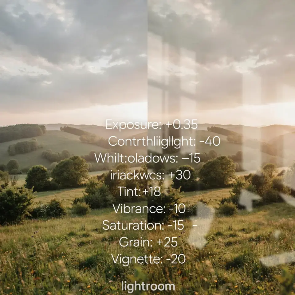
I used to spend hours tweaking sliders on my landscape shots until I finally gave Lightroom Presets for Nature Photography a real try. Honestly, I was skeptical at first. I thought presets would make my photos look like everyone else’s. But after testing a few sets on my own raw files from the Pacific Northwest, I realized they are just a starting point. They save you from starting at zero every time, and once you learn to tweak them for your own eye, they become a real foundation for consistent, professional looking edits. That is what I want to share here: what actually worked for me, and what did not.
Why I Started Using Presets for Forest Photography
Forest shots are tricky. The dynamic range between shadow and highlight is huge, and the greens can look muddy or yellow if you are not careful. I shot a series of images in an old growth cedar grove near my home, and every single one needed a different white balance fix. My frustration led me to look for forest photography presets specifically designed for deep green tones. I tried a free set that claimed to “fix forest colors” and it made everything look like a cartoon. But a paid pack from a photographer who actually shoots in similar conditions gave me a base that needed only minor tweaks. That is when I understood: presets are not magic buttons, they are time savers if you pick the right ones.
How to Choose the Right Preset for Different Light Conditions
Not every preset works under every sky. A preset that makes a golden hour mountain glow will likely blow out highlights on an overcast beach. I keep three categories in my Lightroom catalog: low contrast (mist, fog, flat light), high contrast (sunny midday), and warm/highlight priority (golden hour and sunsets). When I import a batch of nature photos, I first sort by light condition, then apply the preset for that category. It is not perfect, but it gets me 80 percent of the way. Then I adjust exposure, contrast, and sometimes the tone curve to match the actual scene. The key is to check the histogram before you apply anything. Do not trust the preview blindly.
My Go To Workflow for Landscape Edits
Here is the exact routine I follow now. It cuts my editing time in half and keeps my portfolio looking unified. I start with a basic preset that sets the white balance and recovers highlights. Then I go through this checklist before touching anything else:
- Check the histogram for clipping. If highlights are blown, I pull back exposure or use the whites slider.
- Adjust the blacks so the darkest areas still have detail. Nature photos often need a slight lift in the shadows to mimic what the eye sees.
- Use the dehaze slider sparingly. A little bit (+10 to +20) can cut through atmospheric haze in mountain scenes without making things look plastic.
- Apply a graduated filter on the sky if the foreground is too dark. Presets rarely handle that split perfectly.
After those checks, I look at the color. If the greens are too saturated or too yellow, I go into the HSL panel and shift only the green hue a few points toward blue. That single tweak transforms most forest shots.
Customizing Presets to Match Your Personal Style
The first preset I bought came with a subscription. It had a “moody forest” preset that crushed the blacks completely. I liked the feel, but my shots looked underexposed on screen. So I saved a customized version with the blacks slider raised by +20 and the tone curve slightly brighter. That became my own variant. Now I have about six custom presets that I built by taking someone else’s base and adjusting
#LightroomPresets #NaturePhotography #PhotoEditing #LandscapeEdits #PresetInspo
Leave a Comment