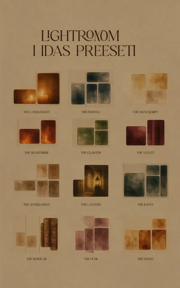
Creating a cohesive photo gallery wall requires more than just picking your favorite prints. The biggest challenge I see in home decor photography is that photos taken at different times, in different lighting, end up with mismatched tones. That is where Photo Gallery Wall Lightroom Presets come in. These free presets help you match the color temperature, contrast, and mood across every image, so your wall looks like a curated collection rather than a random assortment. In this guide, I will walk you through the exact steps to edit your photos for a professional gallery wall, using free presets that make the process simple.
Why Tone Consistency Matters for a Photo Gallery Wall
When I first built my own gallery wall, I printed photos from three different seasons. One had a cool blue tint from a cloudy day, another was warm and golden from sunset, and the third was flat and gray. Hanging them together felt jarring. Tone consistency is what makes a group of pictures feel intentional. It ties the visual story together, even if the subjects vary. Without it, each photo fights for attention.
Matching tones does not mean making every image look identical. It means adjusting the white balance, exposure, and saturation so they sit in the same family of color and brightness. This creates a visual rhythm across the wall. Your eye moves smoothly from one print to the next, and the overall impression is calm and harmonious.
How Lightroom Presets Simplify Home Decor Photography Editing
Editing each photo manually to achieve consistency is tedious. Lightroom presets for home decor photography are saved adjustment sets that apply a specific look in one click. They handle the heavy lifting of color grading, contrast, and sharpness. For a gallery wall, I recommend a preset that softens highlights and adds a slight warmth. This works well for most home decor shots because it mimics natural indoor light.
The beauty of presets is that they give you a starting point. You can apply the same preset to every photo you plan to print, then tweak individual exposures if needed. This ensures a base layer of consistency. I personally use a free preset pack that includes versions for bright rooms, dim spaces, and black and white. That way I can mix styles without breaking the cohesive feel.
Step by Step: Editing Your Prints for a Cohesive Wall Display
Let me share the exact workflow I follow when preparing prints for a gallery wall. It takes about 10 minutes per batch of photos once you have your presets ready.
- Import and cull your images. Choose ones with similar subject types (e.g., all landscapes or all interior details) to make matching easier.
- Apply your base preset to all selected photos. I use a preset called “Gallery Warm” that boosts midtones slightly.
- Check white balance across the group. Use the eyedropper tool on a neutral gray area (like a white wall or concrete floor) to remove color casts.
- Adjust exposure individually so no photo looks noticeably brighter or darker than its neighbors. Aim for a difference of no more than half a stop.
- Sync the edits in Lightroom by selecting all photos and clicking Sync. This copies your preset and any global adjustments to every image at once.
After syncing, I go back and fine-tune each photo’s shadows and highlights. The goal is that if you turn off the grid and look at the thumbnails, they feel like a set.
Free Lightroom Presets for Gallery Walls: What to Look For
Not all free presets are created equal. When searching for free Lightroom presets for gallery walls, look for packs that offer multiple variations within the same color palette. A good set includes a neutral option, a
#LightroomPresets #PhotoGalleryWall #HomeDecorPhotography #FreePresets #PhotoEditing
Leave a Comment