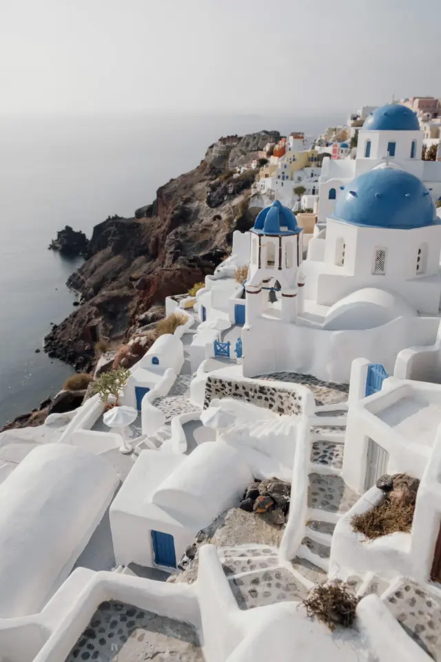
Why Your Santorini Photos Look Nothing Like the Dreamy Pins
You’ve been scrolling through Pinterest, saving every Santorini aesthetic photo editing tutorial, and dreaming of those crisp white walls against cerulean seas. But when you open your own shots from Oia or Fira in Lightroom, the colors fall flat, the whites look muddy, and the sky turns an unnatural neon blue. I’ve been there, and I’ve made every mistake in the book. The good news is that achieving that dreamy blue and white look is less about fancy presets and more about avoiding a handful of common traps. Let me walk you through the six biggest blunders and exactly how to fix them.
Mistake #1: Blowing Out the White Buildings into a Featureless Blob
The most iconic element of a Santorini shot is the whitewashed architecture. But if you pull the exposure slider too far right, you lose all texture in the plaster, and your buildings turn into glowing white pancakes. That’s a dead giveaway of amateur editing.
How to fix it: Instead of boosting overall exposure, use the Whites and Highlights sliders separately. Start by dropping Highlights to around -20 or -30. Then raise Whites only until the brightest part of the wall just barely clips (hold the Alt key while dragging to see clipping). This keeps the walls bright without losing the subtle stone textures and shadows that make them feel real. For extra control, use a masked brush over the sky to keep highlights separate.
Mistake #2: Turning the Sky into a Cartoonish Blue
Deep, rich blue skies are a signature of AestheticPhotography from Greece, but cranking the Saturation slider on the Blue channel makes the sky look fake and hurts the overall mood. Your photo should evoke a real memory, not a stock illustration.
Fix it with Hue and Luminance: Go to the HSL panel. Drop the Luminance of the Blue channel slightly (around -10 to -15) to darken the sky naturally. Then increase Saturation of the Blue channel by only +5 to +10. That’s enough to get that classic Santorini depth without the neon glow. If the sky is too cyan, shift the Hue of Blue slightly toward purple (around +5). This keeps the blues rich but grounded in reality.
Mistake #3: Forgetting the Warmth in Sunset and Golden Hour Shots
Santorini is famous for its sunsets, but many editors overcompensate by cooling the whole image to match the blue domes. That kills the warm golden light that makes those postcards sing. You want the whites to stay white, not turn cold and clinical.
How to balance warmth: Use the Temperature slider sparingly. Instead, add warmth selectively. Increase the Orange and Yellow Saturation in the HSL panel (by +10 to +15). Then use a radial filter over the sky or sun to boost Exposure by +0.3 and Temp by +15. This keeps the buildings neutral while letting the sunset glow hit the horizon and the edges of the architecture. TravelPhotographyEdits live and die by local adjustments, not global ones.
Mistake #4: Letting Shadows Go Completely Black in White Architecture
White buildings in strong sunlight create harsh shadows. Crushing those shadows to pure black might feel dramatic, but it loses the geometric details that make Santorini’s alleys so photogenic. You want contrast, not void.
Preserve texture with Shadows and Clarity: Raise the Shadows slider to +25 or +35 to pull detail out of doorways and shaded corners. Then add a slight Texture increase of +10 to bring out the stucco and stone. For a soft, ethereal look, drop the Dehaze slider to -5 or -10. That adds a subtle mist that mimics the morning haze over the caldera. Use a bulleted checklist for quick reference:
- Shadows: +25 to +35 (bring back texture)
- Blacks: –
#SantoriniPhotoEditing #AestheticPhotography #LightroomPresets #TravelPhotographyEdits #GreecePhotoTips
Leave a Comment