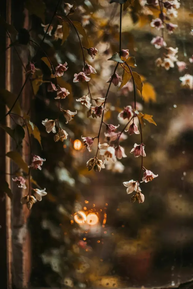
I remember the first time I tried to recreate that soft dreamy look everyone posts on Instagram. My subject was a dusty corner of a friend’s apartment, a wilting fern, and terrible window light. The aesthetic photo editing before and after was laughable. I pushed sliders until the greens looked like toxic waste and the haze looked like a fog machine had exploded. Not cute. But over time I figured out a few cheap tricks that actually work. No expensive presets, no Lightroom subscription required. Just curves, honesty, and a little patience. Let me walk you through it.
Why soft dreamy film looks are easier than you think (on a budget)
Look, you do not need a thousand-dollar camera or a NordVPN ad-sponsored Lightroom plan. The whole “film vibe” boils down to two things: crushed blacks with lifted shadows, and muted, shifted colors. That’s it. I’ve gotten passable results on a five-year-old phone using free apps. Here’s the thing. Most tutorials push you toward buying presets or signing up for pro software. But honestly, you can build this look in a free mobile editor like Snapseed or the basic desktop app Photopea. The technique matters way more than the tool. So stop worrying about gear. Start worrying about curves.
My go to tools: free mobile apps and desktop programs that don’t cost a thing
Not gonna lie, I use three apps and nothing else. Snapseed for quick mobile edits. Photopea in my browser when I want finer control. And occasionally the Google Photos editor for a one-tap base. These are free, zero subscription, no watermarks. Ok so, Snapseed’s “Curves” tool is hidden under the “Tune Image” menu – you have to swipe up to find it. Most people miss it. And Photopea has real curve layers just like Photoshop. I built my entire custom preset in Photopea using a few adjustments I’ll share in a second. No credit card needed. If you want a file-based workflow, just save as PSD and reuse it. So cheap it feels illegal.
The one curve tweak that changed my editing game
I used to randomly drag points on the curve and hope for the best. Predictably, the results looked like a zombie movie. Then I learned one specific shape: flatten the bottom left corner upward (lifting shadows), then bring the top right slightly downward (softening highlights). That simple S-curve, inverted a bit, creates a faded look. But the real trick? Drop a point in the middle of the curve and nudge it just a hair. This prevents the whole image from washing out. I discovered this by accident while trying to fix a blown-out photo of my friend’s cat. The cat looked ethereal. I knew I was onto something. For film style, keep the contrast low but not zero. A little pocket of depth still matters.
Greens and haze: the exact sliders I move (spoiler: it’s simple)
My aesthetic photography editing before and after always involves two color tweaks. First, the greens. I desaturate them by about 30 percent and shift the hue slightly toward teal. Why? Because natural greens in digital photos look too neon. They break the moody vibe. I want a dusty olive tone instead. Second, haze. I use a subtle curve lift on the whole image and then add a faint warm tint in the highlights. That warm haze mimics the look of a scratched film roll. It’s not complicated. I literally move three sliders. If your app has a “grain” option, add a tiny amount – not enough to look like 90s security footage, just enough to soften the edges. And can we talk about the greens in outdoor portraits? They’re the main thing that screams “digital.” So messing with them is a must.
- Desaturate greens by 25-35% – use HSL or selective color tools. If your app lacks those, just lower saturation overall and then add a bit of yellow back.
- Shift green hue toward yellow/teal – around -10 to -20 on most sliders. This removes that sickly bright green look.
- Lift blacks and lower whites – not the same as raising exposure. Whites come down, shadows go up. That creates the haze without washing out midtones.
How to build your own custom preset without copying anyone
Here’s the human answer. I built my preset by saving my settings from one edit I really liked, then tweaking it for different lighting conditions. It’s not a magical one-size-fits-all button. I have three versions now: one for golden hour, one for overcast, one for indoor warm light. To make your own, edit one photo you genuinely love. Hit save as preset. Then apply it to a different photo and notice what breaks. Maybe the sky goes too cyan. Maybe skin tones turn orange. Adjust the offending slider, then save a new version. Do this four times. Now you have a tiny preset pack. I named mine “Dusty Window” and “Cat Nap” and “Ferndale.” Yes, I gave them weird names. It helps me remember the mood. Yours can be whatever. The point is that the preset is yours, not some influencer’s download. And it cost you zero dollars.
Balancing highlights and shadows for that film vibe (real talk)
I used to think film vibe meant blowing out the highlights until they were pure white. Wrong. That just looks like a mistake. Real film has highlight detail, just very soft. So I pull the white slider down, not up. A common mistake. Then I lift the black slider until the darkest parts of the image are a dark gray, not pure black. That alone gives the dreamy effect. But a word of caution: on a cloudy day with low contrast, this method can make your photo look like a grey mess. You have to add a tiny bit of contrast back into the midtones. I do that by changing the tone curve’s mid-point to an ever-so-slight hill. Hard to explain in text, but try this: put one point at 25% input, another at 75%, and gently push the 25% point down while pulling the 75% up by a hair. That keeps the fade but restores some life. Sounds contradictory? It is. That’s why editing is weird and fun.
Real-talk: mistakes I made when chasing the moody look
Oh I made every mistake. I over-sharpened because I thought film needed grain and sharpness. Nope. Film is actually softer. So dial sharpening to zero or negative. I also once applied the same haze preset to a portrait with bright red lipstick. The red turned orange and the person looked jaundiced. Now I know to mask out skin or use a color range tool to avoid that. Another dumb mistake: not checking my edit on an actual screen instead of my phone. The colors looked great on my iPhone, but on my laptop they were muddy and green. So now I always export a small file and view it on two different screens before publishing. If you only edit on one device, you’re lying to yourself about the final look. Honestly, just save a version and walk away for an hour. Come back with fresh eyes. You’ll catch the overdone haze immediately.
Anyway, the whole process is forgiving once you understand the core idea. You’re not trying to make the photo look fake perfect. You’re making it look like a memory. Like something slightly out of time. And you don’t need money to do that. My whole workflow costs zero dollars and runs on a laptop from 2017. If I can get a soft dreamy aesthetic photo editing before and after that fools people into thinking I own a film camera, you absolutely can too.
Try it on a photo you didn’t care about at first. That’s where the magic hides. When you nail it, tag me or just smile to yourself. And if you want to keep the recipe handy, save this pin for later. I’ll be adding more cheap editing tricks soon.
#aestheticphotography #beforeandafter #photoeditingtips #moodyedits #filmstyle
Leave a Comment