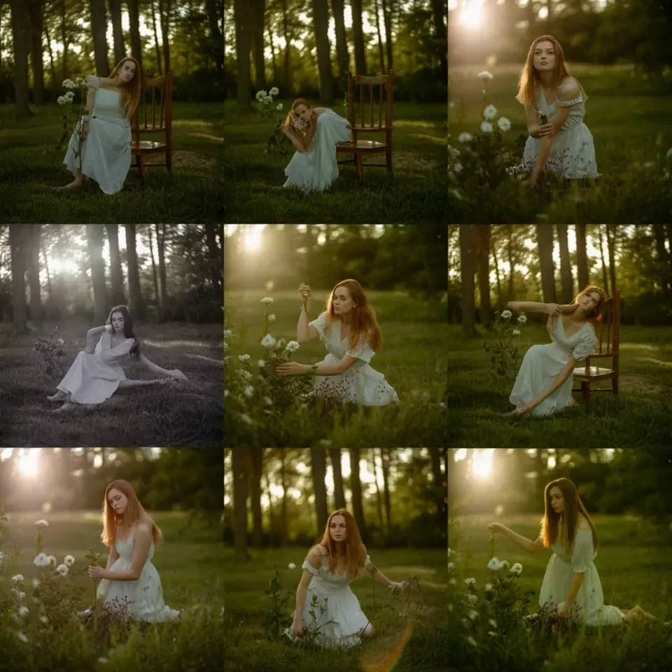
You’ve been scrolling for an hour, pasting free Lightroom presets into your library, and every single one makes your images look like a muddy mess. The white dress in your boho shot is gray, the background is dull, and the whole vibe is completely off. What you actually need is a preset that lets natural light do its thing without flattening every detail into a blown-out void. That’s exactly what this free Lightroom preset does for you.
This preset is built for that high exposure Instagram look, the one that turns a flat, lifeless photo into a bright, airy white feed dream. It lifts the whites, softens the contrast just enough, and keeps the textures in your whites so the whole image feels light, not washed out. And honestly, it’s dead simple to use, even if you’ve never touched Lightroom’s sliders before. I’m going to walk you through exactly what this preset does, why it works, and how to get the same result on your phone in under a minute.
## Why White Feeds Look Dirty Without a Solid Base
Ok so here’s the thing about white feed aesthetics, they almost never work straight out of your phone camera. The sensor in your phone is trained to get a “correct” exposure, which usually means preserving as much detail as possible in the mid-tones. That results in images that feel heavy, slightly underexposed, and full of color noise your eye doesn’t even notice until you see it next to a finished edit.
The preset tackles this by approaching the image backwards. It doesn’t start by adding white, it starts by removing the things that make white look grey and dingy. First, it strips away excess saturation, especially in the yellows and oranges that make wood floors and skin tones look a little too warm for that clean boho vibe. Then it pushes the exposure up, but here’s the clever part, it uses a tone curve that protects your highlights, so the dress straps don’t vanish into a pure white blob. You get the bright look, but the texture stays. For anyone shooting flat lays with linen or facing the camera with a sun dress, this distinction is everything.
## Fine Tuning the Exposure, Highlights, and Whites in the Mobile App
When you first apply this preset on your phone, the image might look a little too stark. That’s normal. Every photo reacts differently because every photo has different starting levels of light. The magic happens when you adjust the Exposure slider to match your original photo’s brightness. If your starting image is dark, drag it up a bit. If it’s already bright, leave it alone. The preset handles the baseline, you just need to zero in on the finish.
Here’s what your adjustments in Lightroom Mobile should focus on:
– **Exposure:** Start here. Your goal is a bright image, but avoid clipping the whites in the sky or on her dress. This means dragging until it looks too bright, then backing off slightly.
– **Highlights:** This is your safety net. Pull the Highlights down anywhere from 20 to 40 points after you raise the exposure. This keeps the detail in white fabric and prevents that ugly, silvery glow.
– **Whites:** Push the Whites slider up. It might feel counterintuitive, but this is where the clean, airy look actually comes from. It affects the whole image’s brightness perception, not just the bright spots.
– **Shadows:** Bring the Shadows up a little to keep the dark parts of the image from turning into black pits. This is crucial for hair in silhouette shots.
The best part about mobile editing is that you can see the changes in real time. Tap and hold on the image to see the before and after, then stop second-guessing yourself. If it looks light, clean, and inviting, you’re done.
## The Simple Order of Operations for a Natural Finish
I’ve seen people watch a three-minute tutorial and immediately start dragging every slider in a panic. Look, order matters, but it’s not rocket science. The way to get the most natural finish is to adjust the preset’s exposure first, then work on the contrast, and finally touch the color. If you start by messing with the tone curve, you’ll end up chasing your own tail.
Think of the preset as a pair of glasses. When you put them on, the world looks clear and bright. But if they’re not the right prescription, you squint. That’s your starting point. Adjust the Exposure and Black Levels before you do anything else. After that, if you want to add some film grain for a little texture, go for it, but keep it subtle. A touch of grain here and there grounds the high key look in reality. It makes the photo feel like something, not just a digital file.
## Adjusting Presets for Different Lighting and Skin Tones
This is where most beginners get stuck. They apply the preset to a picture of their friend in a field, and it looks perfect. Then they apply it to a picture of their child indoors, and suddenly the skin looks ghostly. That’s not a broken preset, that’s a mismatch between the color temperature of the photo and the fixed settings of the edit.
The trick is to treat the White Balance slider as your personal fixer. If the photo looks too cold and clinical, nudge the Temperature slider to the right, just a little. If it looks too warm and beige for that bright white look, move it left. Same goes for skin tones, if the face looks a bit too pink or too pale, adjust the Tint slider slightly toward green to neutralize it. Honestly, for a boho style, slightly warm skin tone with a bright background is usually the sweet spot. It gives that golden hour feel without losing the airy vibe.
## A Note on Flesh Tones and Light Pollution
Here’s a weird thing I learned the hard way, white feed presets hate sodium vapor streetlights. The boho aesthetic thrives on sunlight, morning window light, or hazy shade. If you shoot at dusk under a streetlamp, the `highlights` become a strange mix of orange and green, and no preset is going to fix that completely. This preset works best with soft, natural light. If the light source is your phone’s flash, don’t even bother, honestly, just put the phone away.
When the light is good, the preset protects the flesh tones beautifully. It desaturates the reds just enough to avoid the “overheated” look on cheeks, but it leaves enough color in the lips and skin to keep the life in the frame. That balance is what separates a professional-looking white feed from a snapshot that looks accidentally overexposed.
## What This Boho White Feed Preset Does Not Do
It does not promise to “clean up” photos taken in dirty, yellow interior light and magically make them white. It won’t do that. High exposure presets need good starting material. If you’re in a dimly lit cafe with heavy tungsten lighting, this preset is not the right tool. You’d be better off with a moody preset or fixing the white balance manually.
It also doesn’t freeze motion, fix blur, or remove lens smudges. No preset does. So before you import a photo, wipe your lens and make sure the shot is in focus. A perfectly edited blurry photo is still a blurry photo. Take a second to check your settings and make sure you’re not relying on the preset to do all the heavy lifting.
## How to Get the Mobile Preset and Final Thoughts
Grab the free Lightroom preset right here from the guide, and save it to your phone. This is a mobile preset, so you’ll open Lightroom Mobile, tap Presets, and select import from files. It takes less than thirty seconds, and it will stay in your library forever, to be reused on any future boho shoots or even casual everyday photos that need a little more light. I use it more often than I thought I would, honestly.
Use the preset as your anchor, then remember the two little tweaks that make it yours, the highlights and the exposure. Just for today, try editing a photo you love but previously gave up on. See if you can bring it back to life with just this preset and a few slider nudges. You might be surprised at what you save.
Leave a Comment