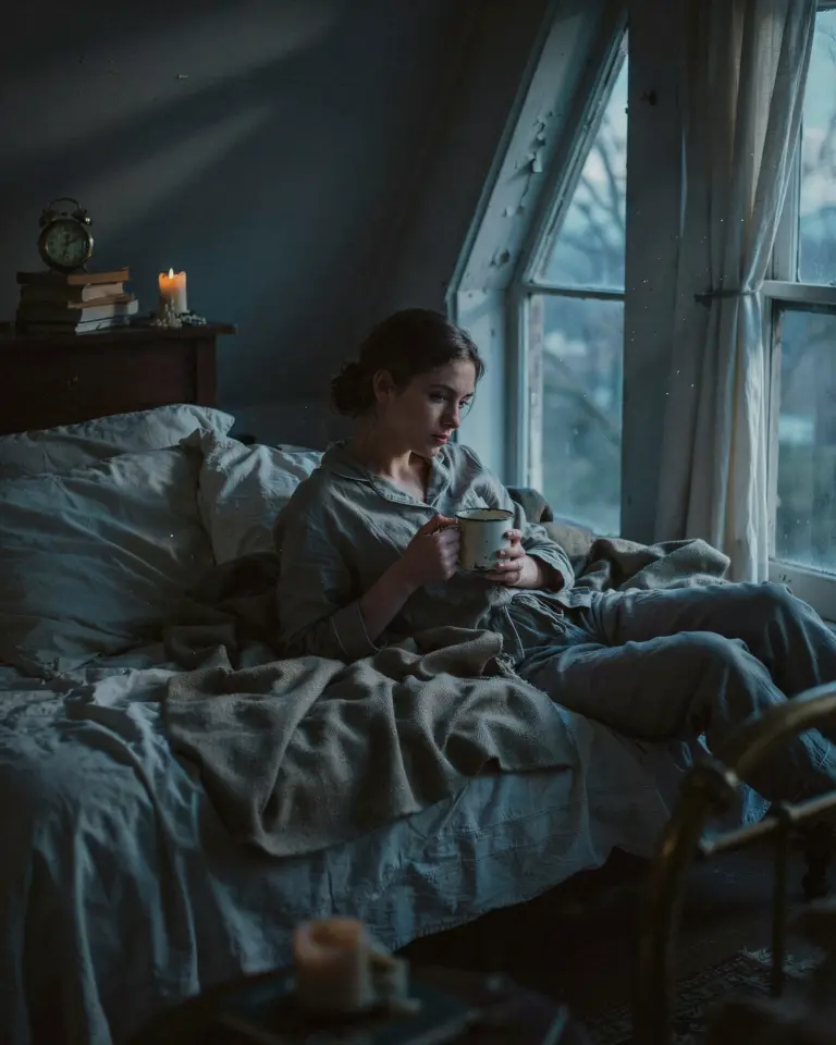
I’ve spent more hours than I care to admit scrolling Instagram, trying to figure out why some photos feel like a rainy London street and others feel like a fluorescent office. It took me a while, but I finally realized the secret: it’s not the filter, it’s the recipe. Aesthetic photo editing isn’t about a single preset; it’s about applying tiny, specific adjustments that push the mood in the right direction. This quick Lightroom settings guide is the exact process I use to cut my editing time in half, and I’m honestly a little annoyed at how simple it is now.
Here’s the thing: I used to fiddle with every single slider in the app, completely terrified I was missing the one magic setting that made my photos look vaguely professional. I’d compare my work to moody accounts that somehow made a puddle look cinematic, and I’d feel like a fraud. But after analyzing every tutorial I could find, I realized most moody edits follow a strict pattern. Lower the exposure, lift the blacks, and add a mysterious tint to the shadows. That’s the secret sauce.
Ok so, before you touch a single slider, you need to set your scene. This recipe works insanely well for flat lays and rainy day city shots, anything with a bit of texture or hard shadows. It does not work great for bright, sun-drenched beach photos where the vibe is pure joy and heatstroke. Know the vibe you want before you start. Honestly, half of the battle is just admitting what you want the photo to feel like.
Start With a Reset and a Straight Crop
Look, the biggest mistake I made for years was editing on top of my camera’s “vivid” setting. If you want moody tones, you need a neutral starting point. Open the photo and go to the Presets tab, then swipe over to the Basic setup. Choose the “Standard” or “Natural” profile if you have one, just to wipe away the overly saturated look. It feels like starting with a clean canvas, but for photography nerds.
Then, before anything else, fix your crop. A crooked horizon will ruin the entire aesthetic, no matter how good your color grading is. Straighten the image using the crop tool and set your aspect ratio to 4:5 if you’re posting to Instagram. This immediately frames the subject properly, and it feels like you’ve accomplished something without doing any actual “work” yet. Small wins, right?
The Base: Lower the Exposure to Kill the Blandness
This is where the magic starts. I’m not gonna lie, the first time I dragged the exposure down to -0.7, I thought I had ruined the photo. It looked too dark, like a cave. But stick with it. Moody aesthetic photography lives in the shadows, and you need to bring them out deliberately.
The exact number here is flexible, but I almost always stay between -0.4 and -1.0. That’s my sweet spot. If you go any darker, you start to lose the subjects, and it just looks like a mistake. The goal is to make the brightest part of your photo look a little muted, like the sun is hiding behind a cloud, not like the sun has been extinguished entirely.
Lift the Blacks to Create That Soft Film Look
This one seems backwards, and that’s why I love it. After you lower the exposure, you might notice the dark areas turn into big, solid black blobs, especially in clothing or tree branches. That looks harsh, like crunching ice in a salad. To fix this, go to the “Blacks” slider and lift it up.
I usually raise the blacks to around +25 or +35. What this does is crush the shadows slightly, fading the absolute pure black into a dark gray. It’gives you that vintage, film-like quality that makes everything feel a little softer and more nostalgic. It’s the single most important step for achieving an Instagram aesthetic that doesn’t look like a default filter. Your eyes will instantly relax when you see it.
Add a Hint of Green to the Shadows (Yes, Really)
Ok so, this is the hyper-specific trick that took my photos from “cropped and dark” to “actually moody.” It’s all in the Split Toning panel, or the Color Mixer in newer versions of Lightroom. I don’t add any dramatic blue tone like everyone suggests. Nope. I add a subtle green tint to the shadow areas.
Why green? I have no idea, honestly. It just works. When you add a hint of green to the shadows, it neutralizes the purples and blues that often pop up in city streets, and it creates a slight organic, mossy feel that is weirdly pleasing to the eye. I set the hue to around 155 (a blue-green teal) with a very low saturation of about 10-15. It’s not supposed to look green. It’s supposed to look “cleaner” in a way you can’t quite explain.
Adjust the Whites for a Subtle Punch
Now that the lows are handled, you need to balance the high end. Don’t chase the exposure back up. Instead, use the “Whites” slider to give your photo a small point of contrast. I usually pull the whites down just a little bit, maybe to -10 or -20. This keeps the highlights from looking blown out.
But here is a quick tip from my personal mess-ups:
– If the photo looks hazy, pull the whites down slightly.
– If the photo looks too flat and lifeless, leave the whites alone entirely.
– If you have a light source like a street lamp, don’t worry about it, the highlights are supposed to be a little blowy in that area.
This slider is the fine-tune knob that separates a moody photo from a bright photo that just has a dark filter slapped on it.
Apply It Quickly: Use the Batch Edit Feature
After you get the settings dialed in on one photo, don’t you dare edit the next one all over again. That’s how you lose your sanity. Tap the three dots in the corner of the edit screen and select “Copy Settings.” Then, open your next photo, go back into the Lightroom panel, and paste those exact settings.
This is the “lightroomtips” part that saves my skin every week. Since all my flat lays are shot in the same spot with similar lighting, I can edit a batch of ten photos in under five minutes. It feels like cheating. It’s not cheating; it’s being smart with your time. Just make sure you check the exposure on each new photo, because sometimes your finger slips and one shot is just slightly different.
When to Break the Rules (The Final Touch)
Look, all rules are meant to be broken, especially in aesthetic photography. Sometimes I add these settings on a photo that already has a lot of natural contrast, and the shadows get too muddy. In that case, I just crank the “Texture” slider up a little bit, like +15. It brings back a subtle crispness to the details, without ruining the soft glow we created.
Also, ignore the standard “Vibrance” and “Saturation” sliders. They are the enemy of moody. They will immediately bring back the loud, cheerful colors you just removed. Actually, I often subtract a tiny bit of the overall saturation, maybe -5, just to tamp things down further. It’s a permanent part of my recipe now, and it makes a huge difference in how cohesive my feed looks.
That’s the whole recipe. It sounds almost too basic, but give it a shot on your next batch of photos. You’ll probably find yourself skipping half the steps you used to rely on because you finally know what you’re actually doing to the image.
Anyway, I’d love to hear if you try this lightroom recipe out. Tag me in your results or drop a comment below to let me know how the green shadows work out for you, I want to see if it helps you as much as it helped me.
Leave a Comment