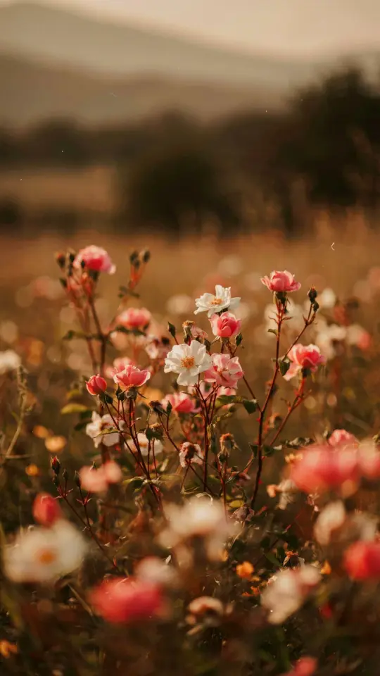
That photo you took at 6pm, the one with the soft shadows and hazy skyline, has way more potential than the flat JPEG your phone gave you. Aesthetic photo editing in Lightroom is how you pull that potential out, and the film look is the most forgiving style for beginners. I have been editing my own travel and street photos this way for years, and the secret is almost embarrassingly simple. You lower contrast, raise exposure, and add grain, but the order and the little tweaks around those three moves are what make it look intentional rather than washed out.
The best part is that this works on phone photos, old point-and-shoots, and even professional camera files. You do not need expensive presets or a computer that sounds like a jet engine when you open Lightroom. Just a few sliders and a willingness to stop chasing crispness. Because the film look is not about sharpness at all. It is about mood, texture, and a little bit of beautiful imperfection.
Start With My Base Recipe for a Soft Film Foundation
I almost never start with a preset. The film look is too personal for that, and honestly, presets made by strangers rarely fit my specific lighting. The base recipe is simple and you can memorize it in ten seconds. Lower contrast to around minus 25. Raise exposure by half a stop or a full stop, depending on how dark the original shot is. Then add grain.
The grain slider is where most people mess up. You want it visible but not distracting. I usually set the grain amount somewhere between 25 and 40, the size to around 60, and roughness to 50. This creates that organic, slightly dusty texture you see in old Kodak or Fuji films. It hides skin imperfections too, which is a bonus nobody talks about enough.
One thing I always tell my friends who ask for editing help is to ignore the way the photo looks at 100 percent zoom. Film grain was never meant to be inspected at pixel level. It was meant to be seen as a whole image, the way your eye naturally takes in a scene. Zoom out, look at the vibe.
Let the Highlights Glow Without Blowing Them Out
This is the trick that separates a dreamy film photo from a blurry mess. Soft, glowing highlights are the signature of the film aesthetic, but you have to control them carefully. In Lightroom, pull the highlights slider down to around minus 40 to minus 60. Then raise the whites slider just a tiny bit, maybe plus 5 to plus 10.
This creates a gentle bloom in the brightest parts of the image without losing the details. Think of it like light passing through a foggy window, soft but still readable. If the highlights get too aggressive, your image will start to look like a 1980s music video, and not in a fun, ironic way.
For portraits, this is especially flattering. It catches the light on the edges of the hair and cheekbones in a way that looks like golden hour all day long. Just keep an eye on the background. A blown-out sky is one thing, but a blown-out white wall can look like an accidental overexposure.
Use the Tone Curve for That Subtle Color Grade
Every film stock has a personality. Kodak Portra leans warm and green in the shadows. Fuji Superia goes slightly cool and blue. You can fake these personalities in the tone curve section of Lightroom, and it takes about one minute once you understand the trick.
The easiest move is to lift the bottom left corner of the RGB tone curve. This part of the curve controls the blacks, and lifting it gently transforms harsh, solid blacks into a soft gray, which is the heart of the film look. It instantly makes the photo feel older and a little more nostalgic.
Then, in the Red channel, pull the bottom left point slightly down and the top right point slightly up. This adds a tiny bit of warmth without making the whole image look jaundiced. The Blue channel does the opposite, subtract a little blue from the shadows to add that teal-ish green quality, but keep it extremely subtle. This is where people go wrong and end up with a cartoon.
My Favorite Color Grading Trick for Instant Dreaminess
The color grading panel in Lightroom is my playground. Ignore the generic advice you see about using complementary colors. For a dreamy film look, I stick to warm tones in the shadows and a whisper of teal in the highlights.
Set the Shadows color picker to a soft orange or peach, and keep the saturation around 8 to 12. Then set the Highlights to a light teal or cyan, but push the saturation lower, around 5 to 8. This creates a gentle color contrast that feels cinematic. You get orange shadows and teal highlights, but it is much more muted than the blockbuster movie style.
The result is an image that feels warm in the dark parts and cool in the bright parts. Your eye moves around the photo naturally. If you have ever looked at a photo and thought it felt “expensive” without knowing why, this subtle color split is probably the answer.
A Practical List of Lightroom Mobile Settings to Keep Handy
Sometimes you just want the numbers without the theory. Here is my go-to starting point when I edit a photo on my phone with the Lightroom app. It works for most daylight photos, and you can tweak from there.
- Exposure: +0.5 to +1.0 (only if your photo is not already too bright)
- Contrast: -25 (this kills the harsh digital look)
- Highlights: -50 (let the glow come through)
- Shadows: +15 (bring back some detail softly)
- Whites: +8 to +12 (add a subtle brightness to the overall frame)
- Blacks: -10 (keep the image grounded)
- Texture: +5 (restore a bit of organic detail)
- Clarity: -15 (this is the dreamy crux, do not skip it)
- Dehaze: -5 (light atmospheric haze works wonders)
- Grain: amount 30, size 60, roughness 50
Use this as your blank canvas. Some photos will need more contrast, some will need less grain, and that is okay. This list is just the map, not the destination. I have saved it as a preset on my phone, so I can one-click apply it and adjust from there. It saves so much time when I am editing a batch of photos from a single day.
Try a Creative Curve for a Unique Film Stock Feel
For a look that feels like an old analog photo from the 90s, I like to create a custom S-curve. This is not the standard S-curve you see in every tutorial. That one boosts contrast, which is the opposite of what we want. Instead, I make a very shallow S-curve that mostly affects the midtones.
Put a point on the curve at the lower middle, and pull it down just slightly. Then put a point on the upper middle and pull it up slightly. This adds a soft contrast to the middle tones, but leaves the shadows lifted and the highlights muted. It is a strange, subtle twist that creates depth without losing the hazy, dreamy foundation.
If you want to get really experimental, try doing this in individual channels. A slightly steeper S-curve in the Red and Blue channels can mimic the color shifts of expired film. Expired film is a real thing, the colors get weird and uncanny, and this is the closest digital equivalent I have found. It is honestly a fun rabbit hole.
Finish With the Right Export Settings for That Social Vibe
The editing is only half the battle. If you export your photo wrong, all that careful work gets flattened and compressed into mush. I used to make this mistake constantly, exporting at full resolution and wondering why the photo looked different on Instagram.
For a film look that feels authentic on social media, keep your file size reasonable. Export at a long edge of 2048 pixels for Instagram, and set your resolution to 72 DPI. The DPI does not matter for screens, but it keeps the file size low without destroying quality. Use a JPG quality of around 80 percent. Any higher and you are just wasting storage space.
Also, do not let the app auto-enhance your photo after you upload it. Instagram’s sharpening tool is the enemy of a dreamy film look. It adds that crunchy digital edge that ruins everything. Turn off the “best quality” toggle if you have it. The small file size is enough.
Own the Process and Make It Your Signature
The whole reason this film look trend has lasted is because it lets ordinary photos feel nostalgic and personal. You can copy my settings exactly, but your photos will still look like yours. The lighting, the colors, and the moment you captured are all unique to you, and that is what makes the edit work.
Play with these techniques on a few different types of photos. Try one portrait, one landscape, and one weird snap of your coffee cup. You will start to see which parts of the film look you lean into naturally. Some people love heavy grain, others prefer the glowing highlights. Your instinct is part of the process.
I would genuinely love to see what you come up with. Try this on your next edit, save the setting recipe for later, and let the photo do the talking. The dreamy vibe is one good edit away.
Leave a Comment