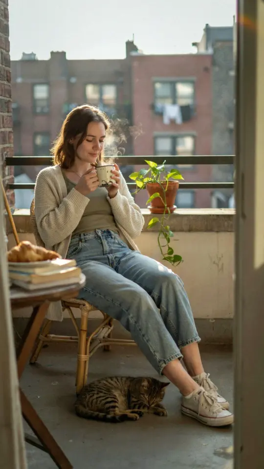
Here’s the thing about aesthetic photo editing: most people think you need a thousand slider tweaks to get that soft, dreamy look. I used to be one of them.
Then I burned an entire Sunday sliding the Dehaze tool back and forth, ended up with a batch of orange, murky images, and nearly quit the whole hobby out of pure frustration. What actually worked turned out to be almost embarrassingly simple. I built a Lightroom preset setup that relies on just a handful of deliberate adjustments, a soft tones editing workflow that I can run through in about a minute and a half per photo. It’s the difference between guessing at your edits and knowing exactly what needs to happen.
Look, I’m not a professional photographer. I’m someone who got tired of my photos looking either plastic and sharp or muddy and dull. After a lot of trial and error, this is the system that honestly changed my entire relationship with my camera roll.
## A photo editing workflow that doesn’t feel like a second job
The whole reason I started messing with Lightroom presets was speed. I was coming home from a walk with about forty decent shots, and the thought of editing each one individually made me want to take a nap instead.
So here’s my setup. Ok so, I use the preset as a starting point, not a finish line. The preset itself handles the baseline soft tones, but I still go into each image and make tiny corrections. That sounds like more work, but it’s not. I check the white balance first. Then I adjust the exposure by a quarter stop or so. Then I look at the histogram to make sure I haven’t clipped anything.
The goal is to get every image to about eighty percent perfect with one click. The remaining twenty percent is just the fun part, making it look like *my* photo.
## How to soften a photo with Lightroom presets (the right way)
I have a specific type of preset I gravitate toward for that aesthetic photography look. It’s not the one with the super dramatic teal and orange split-toning. That look has its place, sure, but it always looks too heavy for the mood I want.
What works for me is a preset that focuses on lifting the blacks and taming the highlights. If you want to soften a photo, you have to reduce the distance between the darkest and brightest areas. You pull the black point up until the shadows turn into a gentle grey, and you bring the highlights down so they never harshly blow out. It’s like turning down the volume of the image, but on a visual level. It makes everything look hazy, but in a good way, like you’re remembering the moment rather than just staring at it on a screen.
## The white balance trick that fixes the whole vibe
This took me forever to learn. I used to obsess over the exposure slider and completely ignore temperature. Then one day I was editing a photo of my dog in the afternoon sun, and the grass looked radioactive. I mean, truly glowing green in a way that grass has never looked in the history of the world.
I finally messed with the white balance maybe twenty minutes later. I dragged the temperature slider slightly to the cool side, just a small nudge. That was it. The green settled down. The whites in the photo became cleaner. It was the most obvious fix in the world, and I had been ignoring it for months. So now, my absolute number one photo editing tip is this: fix the white balance before you fall in love with the preset. Presets look different in every light situation. A preset built for golden hour will look sickly in the shade. Adjusting the temperature to neutralize the scene is the secret to making the same preset work across all your photos.
## Why I stopped touching the contrast slider so much
This is where the “drop contrast” part of my process comes in. I’m not saying you should delete the contrast slider from your screen, but I am saying you should be suspicious of it. I used to crank it up to make my photos “pop.” All it really did was make them look harsh and dirty.
Here’s the thing though. You don’t actually need to eliminate contrast. You just need to be smart about it. Instead of using the main Contrast slider, I use the tone curve. It’s much more precise. I raise the bottom left corner of the RGB curve to get that matte, lifted black look. Then I do a very slight S-curve in the middle just to keep some depth in the image. The result? Soft, airy tones without looking like the photo has been washed with bleach. That’s the sweet spot.
## Keeping skin tones natural while making everything else dreamy
You know what makes a photo of a person look terrible? When the preset you love turns their face into a cross between an orange and a Cheeto. It’s a problem you will absolutely run into with soft tones editing if you aren’t careful.
Listen. Here is what I do. I use a brush mask on the skin. It takes about thirty seconds. For that specific mask, I run the HSL panel to slightly desaturate the oranges and reds. I also pull the luminance up on the reds a little, because that gives you that glowy, soft-focus look on the cheeks without actually blurring anything. It’s a total game-changer, honestly. You get the dreamy background, but the person in the photo still looks like a person and not a mannequin made of wax. If you try to do this on a phone camera, it takes ages. With a targeted mask in Lightroom, it takes no time at all.
## My go-to preset recipe for that specific soft, airy feel
Alright, for those of you who are skimming this, here is the exact breakdown of my actual preset settings for the “dreamy” look.
– **White Balance:** Cool down by 300-500 K. Always use the eyedropper if you have a neutral white in the frame.
– **Tone Curve:** Raise the black point by half a notch. Lift the shadows slightly.
– **Contrast:** Set the main contrast slider to around -10. The curve handles the rest.
– **Saturation:** Drop overall saturation to -5 or -8. Nobody wants colors that scream at you.
– **Details:** Turn Sharpening way down. I usually drop it to 20 or below, right from the default of 40. It makes everything silkier.
That’s the whole recipe. I’m not even joking. There are people out there selling preset packs for thirty bucks that are just this, but with a fancy name like “Film Grain Soft Cream” or something ridiculous. Look, I didn’t invent this, it’s honestly just the golden ratio for a gentle, pretty picture.
## A final workflow trick to speed up every session
The biggest mistake I ever made was editing the first photo perfectly and then trying to replicate those settings manually on the next photo. It never matched. Just don’t do that. Sync the settings. When you find the right look on one image, right-click and copy the settings, then apply them to the rest of the batch. Then just go through each photo and adjust the exposure or composition individually if you need to.
This system takes my average edit time from about five minutes down to about thirty seconds. It’s why I actually enjoy editing now. It feels less like data entry and more like the final step of taking the photo.
If you’re stuck staring at your own preset library and hating everything you see, try removing half of the things you’re adjusting. Go back to the basics. Use a preset to get the foundation of soft tones, then just check your white balance and contrast. That’s the entire magic trick. The pictures will look clean, calm, and full of that aesthetic style you’re chasing, without ever looking over-processed.
Go ahead and pull up that photo you’ve been avoiding. Give this workflow a shot, and see if you don’t finally get the look you’ve been after. You might surprise yourself by actually liking the result.
Leave a Comment