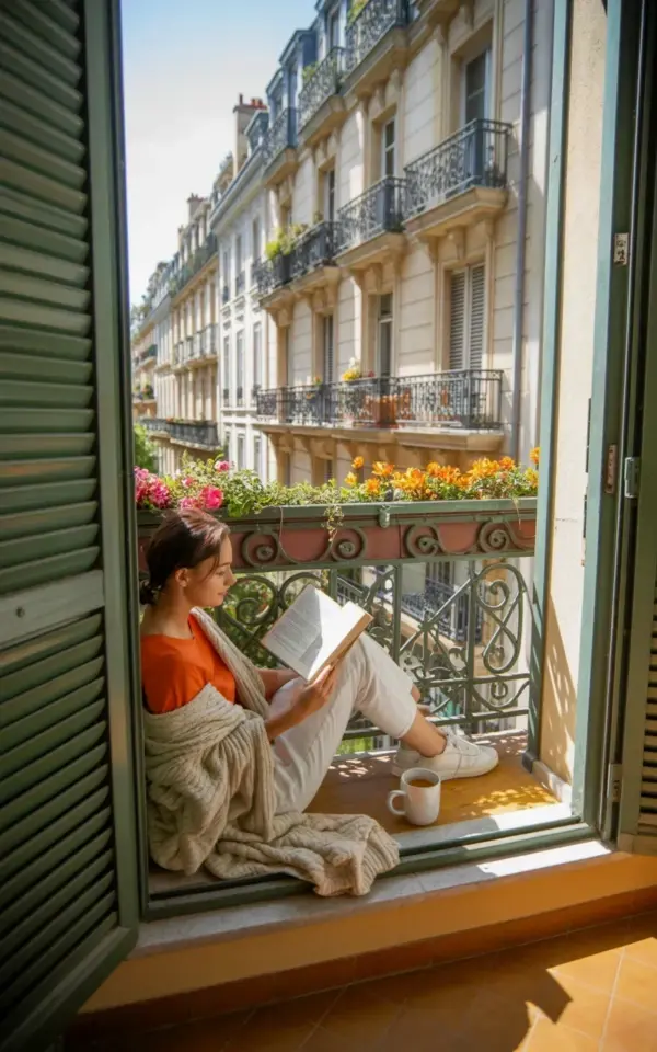
Before and after photo editing often looks like sorcery on social media, but the best transformations are actually pretty simple to recreate. A few weeks ago, I sat on my small European-style balcony, looked at the flat, lifeless photo I had just taken of my morning coffee, and decided to fix it the right way. The result was a warm, sunlit escape that made my feed look like a lifestyle magazine spread. This particular aesthetic photography session involved a woman in an orange top, a cream-colored knit blanket, and a whole lot of patience with my editing app.
The original image wasn’t bad, but it was honest. The railing was a dull grey, the sky looked like dishwater, and the vibe was more “waiting for a repairman” than “sunlit escape.” I wanted the photo to feel like a warm hug, not a security camera still. Honestly, the biggest mistake most people make is trying to add light to a photo, when they should really be adding color and contrast.
What the Original Balcony Photo Actually Looked Like
It was a cloudy Tuesday morning, and the light was flat. The green wrought iron railing that looks so chic in person appeared murky and dark, and the white coffee cup just blended into the white pants of the woman in the shot. There was a lot of potential hiding in the shadows, but the camera sensor just didn’t care about my artistic vision.
The biggest issue was the temperature. The whole scene leaned slightly blue and grey, which is the death knell for a balconyaesthetic post. I needed to inject some warmth into the stone facade and make those pink and orange flowers pop against the dark green metal. It’s all about creating the illusion of a perfect summer morning, even when the reality is a bit more overcast.
My Photo Editing Workflow for a Warm, Sunlit Look
I started with the basics in Lightroom, because you have to get the foundation right before you start playing with the fancy tools. The first slider I touched was the white balance, and I moved the temperature towards the yellow spectrum until the cream-colored knit blanket looked soft and inviting instead of sterile.
Then came the exposure curve. I lifted the shadows slightly to reveal the texture in the white pants, but I didn’t touch the highlights on the coffee cup. Here’s the thing: blowing out the highlights kills the depth. You want the sunlight to look like it is *hitting* the scene, not that you just cranked the brightness until everything looked washed out. This is the difference between a filter and a real edit.
Using Color Grading to Change the Entire Vibe
This is where the magic really happens, and it is my favorite part of the process. I used the split-toning tool to add a touch of peach to the shadows and a slight golden hue to the highlights. It gives the image that “golden hour” feel without having to actually wake up at 5 AM to shoot it.
The key to making the orange top look electric without making the skin tones look like a Cheeto is to isolate the color. I used the HSL panel to target the orange saturation and luminance specifically. I brought the saturation up to 85, but I also added a slight red tint to it to keep it rich. I did the same for the pink flowers on the railing, making them slightly more vivid so they draw the eye along the French architecture lines in the background.
Retouching Details and Textures for a Natural Finish
No one wants to look like a plastic doll, and the same goes for the furniture and fabric in your shots. The knit blanket needs to look chunky and tactile. I added a slight clarity boost to the edges of the blanket to make the wool texture pop, but I applied a mask to keep my subject’s skin smooth.
I also selected the ornate wrought iron railing and increased its contrast. It sounds weird, but making the dark green railing darker on the edges gave the entire photo a frame, drawing your eye back to the relaxed woman reading her book. It creates a lot of depth. If I could give you one tip for this aesthetic photography thing, it is to learn how to use the masking tools properly.
The Best Tools and Brushes for Aesthetic Photography
I am a big believer in using a **visual pack** or **creatorpack** to speed up my workflow, especially for instagram stories. However, for the main grid, I always go manual. Here is a quick list of what I actually use:
– **Lightroom Classic:** For the main color grading and exposure work.
– **Snapseed:** For the quick “selective adjust” tool, which is great for brightening the face without blowing out the sky.
– **VSCO (sometimes):** Just for the grain filter. I am a sucker for a little film grain.
The grain is crucial. Without it, the image looks too clean, too digital, almost sterile. Adding a subtle grain texture helps sell the authenticity of the shot, even if the original scene was as flat as a pancake. I usually add it last, after I’ve exported the photo once and brought it back in. I don’t know why, but it sits better on the image that way.
Balcony Styling Tips That Make Editing Easier
Ok so, I have to admit something. A great edit can only do so much. If your physical space looks chaotic, no amount of sliders is going to fix it. This specific shoot worked because we had a cohesive color palette in real life, not just in the post-processing.
We stuck to the cream blanket, the orange top, and white pants. No neon signs, no random plastic bottles. The white coffee cup was placed strategically to catch the (minimal) natural light. I also recommend using faux flowers for these shoots, the real ones can look amazing but they also wilt under the heat of a single lighting setup. The pink and orange flowers on the railing stayed in place for hours without looking tired, and it made my job so much easier in post.
Why the Creator Pack is Worth It for Beginners
If you are just starting to play around with photo editing, investing in a solid **creatorpack** is a smart shortcut. I resisted them for a long time because I thought it was cheating, but honestly, they are just learning tools. They show you how the pros think about color theory without having to spend years messing up your own photos.
You still need to adjust the intensity of any preset you download, because every photo has a different starting point. But having a pack of specific presets designed for that “sunlit European balcony” look gives you a baseline. It turns a 30-minute edit into a 5-minute tweak. I still use them for my story highlights all the time, and I recommend finding one that suits your specific style, whether that is moody, bright, or pastel.
The whole point of this before and after exercise is to show that a little intention goes a long way. Whether you are using a creator pack or just your thumbs in a free app, the goal is to make the viewer feel the sunshine on their skin. I hope this helps you see your own spaces differently, and maybe look at that boring balcony railing with a new sense of possibility. Go take the photo, open up your editor, and just try one thing at a time. It’s easier than you think, and the results are so satisfying.
Leave a Comment