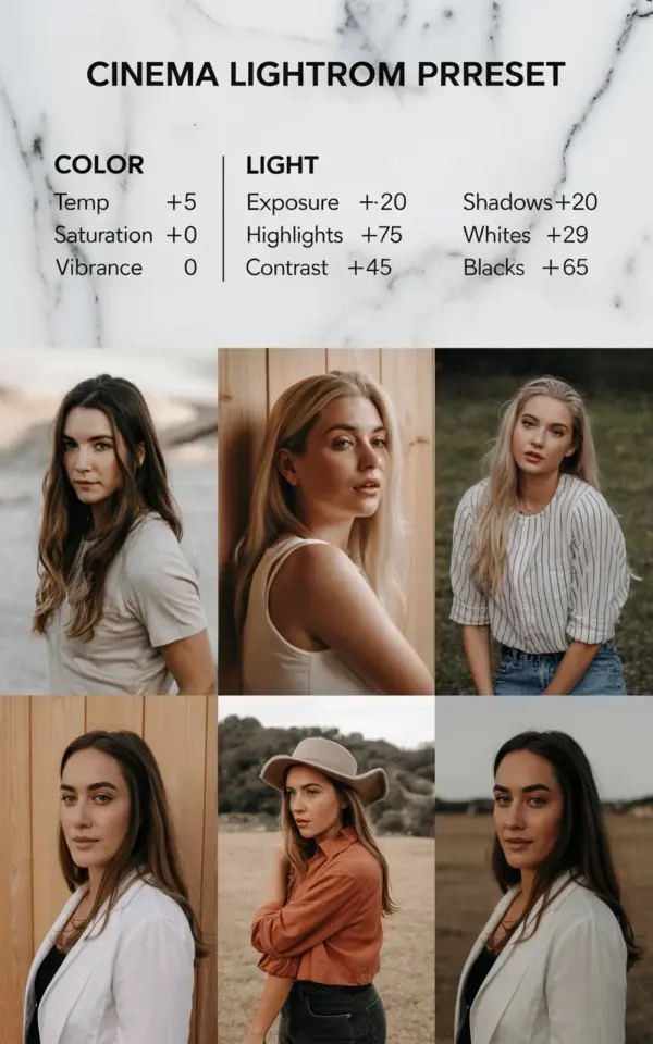
You have a folder full of portraits that feel technically fine but emotionally flat, and you’re not alone in that. I remember the exact moment I realized cinematic editing wasn’t about adding more color, it was about subtracting the right things. This cinema lightroom preset guide takes the guesswork out of that process, giving you a cozy, film-inspired look that works beautifully for lifestyle and fall photography.
What Makes a Lightroom Preset Feel Cinematic?
Cinematic edits have a specific mood, they feel like a still frame pulled from a quiet indie film. The secret isn’t one dramatic slider move. It’s a combination of muted colors, softened highlights, and shadows that hold just enough detail to feel intentional.
When I first started editing, I thought cranking up vibrance would give me that film look. Big mistake. Film photos, especially the cozy ones, actually have a slightly faded, dusty quality. They don’t pop. They whisper.
Here’s the thing: you can recreate that feeling with a few targeted adjustments in Lightroom, no expensive preset packs required. All you need is a basic understanding of how the temperature, light, and color sliders work together. That’s what we’re building together right now.
Lightroom Preset Guide for Cozy Photography
This particular setup was designed for cozy photography, the kind of session where golden hour hits through a window, or you’re shooting a friend wrapped in a chunky knit sweater. These settings lean warm but not orange, moody but not dark, and they give skin that soft, believable glow.
The most common mistake beginners make with presets is applying them blindly to every photo. I get it, it’s tempting. But presets are really just a recipe, and like any recipe, sometimes you need to taste and adjust. This guide gives you the exact starting point so you can learn what each slider actually does to your image.
Once you understand the why behind each number, you’ll never be afraid of the Develop panel again.
Color Settings Breakdown for a Cinema Lightroom Preset
Let’s start with the color section, because this is where the mood of a cinema lightroom preset is born. The adjustments here are subtle, which is exactly why they work so well for portraits.
- Temp +5: A tiny nudge toward warm, just enough to take the clinical blue out of a shade.
- Tint -20: This pulls some green in, which counters redness in skin and gives that slightly muted, vintage feel.
- Saturation 0: We’re not touching global saturation here, we want the colors to fall naturally.
- Vibrance 0: Same rule applies. Keep it neutral and let the other sliders do the heavy lifting.
Honestly, the tint slider is the unsung hero of this entire recipe. Most people ignore it or they panic when they see skin turn a little green. But trust the process, it works. When you pair that -20 tint with the light adjustments below, the skin tone settles into something creamy and realistic, not over-saturated and fake.
Light Settings That Create the Film Look
Now for the light section, this is where the magic really happens. If the color settings are the personality of the edit, these sliders are the lighting crew behind the scenes. They shape how the photo feels before you even notice the colors.
Exposure +0.20 lifts the overall image just a touch, but not so much that you lose the shadows. Highlights -75 is the big one, this tames any blown-out areas and brings back detail in bright windows or light fabrics. Then Shadows +60 fills in the darker parts of the image, so your subject’s hair or a dark background doesn’t become a black void.
The contrast slider gets set to +45 here, which seems counterintuitive when you’re softening highlights. But it actually restores the dimension that the highlight and shadow adjustments took away. It’s a balancing act. And finally, Whites +29 and Blacks +65 work together to compress the tonal range, which gives that classic, slightly washed-out film character.
I know that’s a lot of numbers to throw at you. Just apply them and look at the difference, then play with them one at a time to see what happens. That’s the best way to learn.
How to Use These Portrait Presets in Your Workflow
Alright, so you’ve plugged in these numbers and your photo already looks better. Now what? The real skill is knowing how to adapt these portrait presets to different lighting situations without breaking the mood.
If your photo was taken in harsh midday sun, you might need to drop the highlights even further or add a touch more exposure. On the other hand, a photo taken in deep shade might need the temperature pulled up to +8 or +10 to get that same warm cozy feel. These are not rules, they’re starting points.
The best part about using this as your baseline is that you can save it as a preset and apply it to your whole session. Then you just tweak individual photos where needed. This saves you hours of editing time, which as a lifestyle blogger, you probably really need.
And yes, I have a love-hate relationship with how much time I’ve wasted manually editing photos that looked nearly identical. This workflow changes that.
Pro Tips for a Beginner Friendly Editing Routine
Look, I wish someone had told me this earlier: always edit in natural light. Your monitor and the ambient light in your room affect how you see colors, so if you’re editing at night in a dark room, your photos might end up looking too dark or too yellow on other screens.
Also, don’t forget to straighten your horizons and crop before you start tweaking colors. Most Lightroom preset guides skip this step, which is weird because it’s a rookie mistake that ruins an otherwise good photo. A slightly crooked horizon will distract from even the prettiest grade.
You should also consider exporting your full-resolution image before you start comparing it to your friends’ Instagram posts. Compressed web versions always look different. Once you have the full export, you can judge the actual quality of your editing work.
Adding Your Own Twist to This Film Look
Once you’re comfortable with these settings, start experimenting. Maybe you want a slightly cooler edit for a winter shoot, drag the temp down to -5. Or maybe you want even more contrast for a dramatic portrait, push it to +55. The point is to make this preset your own.
Sometimes I add a very subtle vignette, like -10, to pull the eye directly to the subject’s face. It’s a small tweak but it adds another layer of that cinematic depth. Other times, I use the Tone Curve just to lift the darkest black point a tiny bit, which instantly makes any photo look more like film. Try that one, trust me.
Rule of thumb: if the edit looks “too much” at any point, dial it back by half. The cozy aesthetic is supposed to feel effortless and comfortable, not dramatic and loud. Your photos should look like a quiet Sunday afternoon, not like a blockbuster movie poster.
Your Next Step with These Cozy Film Settings
This exact recipe works best on portraits shot in soft, natural light, think near a big window or on a porch during golden hour. It’s less effective for neon-lit street scenes or stark flash photography, but for cozy photography, it’s pure gold.
Save this guide, bookmark it, screenshot it, whatever you need to do. The next time you have a session that calls for a warm, film-inspired look, you’ll have a reliable starting point that won’t let you down. Go open Lightroom, drop these numbers into a raw file, and see the difference for yourself.
Once you try it, you’ll probably wonder how you ever edited without a clear plan. And hey, if it feels a little messy at first, that’s okay. Editing is a skill, and you just leveled up. Start with one photo, compare it to an unedited frame, and see just how much depth those subtle changes really add.
Leave a Comment