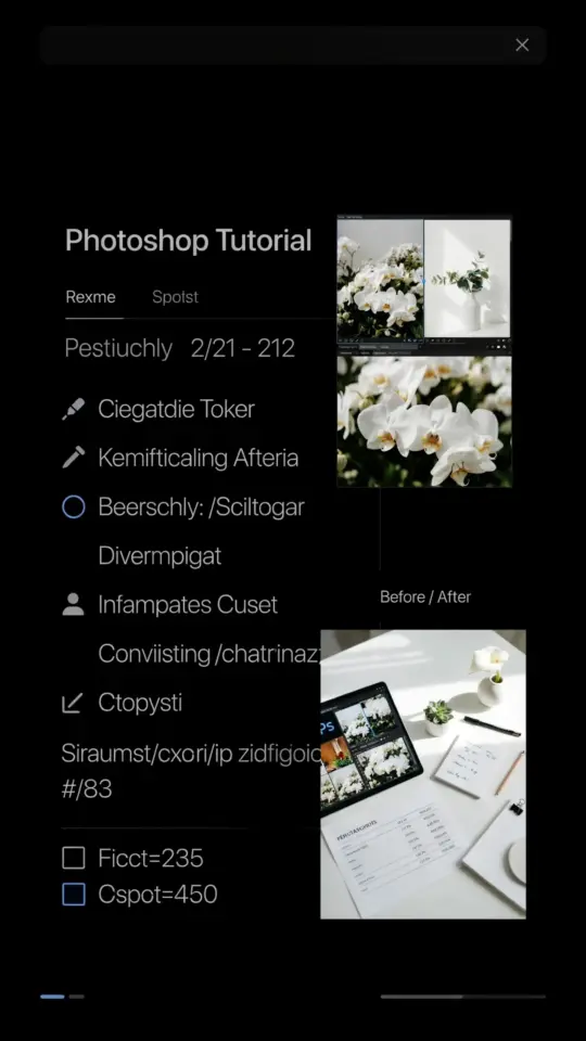
Honestly, I almost didn’t write this article. I have about fourteen folders of raw photos from last October sitting on my desktop, and looking at them reminded me that I still haven’t processed half of them. But that’s exactly why this cozy Photoshop tutorial is the one I keep coming back to. If you are a lifestyle blogger juggling flat lays, coffee cups, and soft window light, you know the struggle of wanting that warm, film-inspired look without spending an hour per image on complicated color grading.
This workflow is built for real life, messy backgrounds, imperfect lighting, and all. It uses simple adjustment layers and a few tricks I’ve stolen from photographers who actually shoot on film, adapted for digital files. So grab your coffee, put on something cozy, and let’s make your photos feel like a slow Sunday morning, even if you shot them on a Tuesday after work.
Setting the Mood with the Camera Raw Filter
Okay so open your image in Photoshop, not Lightroom, because we are doing everything right here. Before you do anything else, convert your layer to a smart object. Right-click the background layer and choose “Convert to Smart Object.” This is non-negotiable for me, honestly, because it lets me adjust the filter settings later without starting over.
Now go to Filter and select Camera Raw Filter. This is where the magic starts to happen. Instead of dragging every slider randomly, I focus on two things first, the white balance and the exposure. Look for the little eyedropper tool near the top, and click it on a neutral part of your image, something white or grey like a mug, a wall, or a paper napkin if you have one in frame.
That single click will fix any weird green or blue casts faster than anything else. It never fails to surprise me how much life it brings back to skin tones. After that, I bump the temperature slider up just a touch, maybe +5 or +10, to start warming things up. It’s subtle, but it lays the foundation for everything else we’re about to do.
Warming Up Skin Tones Without the Oompa-Loompa Effect
Here’s the thing about warm tones, they go wrong really fast when you just crank the warmth slider to the max. You end up with orange people, and nobody clicks away from a feed full of fluorescent tangerine skin. Instead of doing that, I use the HSL panel inside the Camera Raw Filter to target specific colors.
Open the HSL/Adjustments tab and click on the Saturation tab. You want to drop the orange saturation slightly, around minus 10 to minus 15. It sounds counter-intuitive, but making the oranges less intense actually makes the skin look creamier and more natural.
Then, click on the Luminance tab and darken the oranges just a bit. This creates that depth film photos have, like the light is wrapping around the subject, instead of just flattening them out. Your skin tones will look warm and healthy because the shadows have a slight golden tint, but your highlights won’t be blown out or glowing like a jack-o’-lantern. It’s a delicate balance, but it works.
Muting the Greens and Yellows for Muted Autumn Vibes
This is the part that really sells the “cozy fall” aesthetic for lifestyle bloggers. Think about your scene, the plants in the background, the tea towel hanging over the stove, or the grass outside the window. In digital photos, those colors often look a little too electric, too neon, to feel nostalgic.
So in that same HSL panel, go to the Saturation tab and pull the greens and yellows down by about 20 to 30 percent. You aren’t trying to make them disappear, you’re just knocking the intensity down a few notches. The leaves on that monstera plant will turn a dusty olive green instead of a bright, stressful shade of spring green.
If you want to lean into the film look even more, shift the hue of the greens slightly towards yellow. Just a nudge, maybe +5, does the trick. It’s a tiny movement, but it immediately gives the image that “shot on Portra” feeling that everyone obsesses over. You want your colors to feel like they’ve been fading gently in a scrapbook for a decade, not glowing from a screen.
Building That Analog Grain Overlay
Alright, so the color is almost there, but it needs texture. Digital photos are too clean, too sharp, too perfect. Film has a soft, organic grain that makes it look like a memory. You can buy fancy film grain overlays, but honestly, Photoshop can do this in about fifteen seconds.
Go to Filter, then Noise, and select Add Noise. I know, it feels like you’re ruining your photo, but trust the process. Use an amount of about 8 to 12 percent, or keep it lower if you shot at a high ISO. Choose Gaussian distribution and check the Monochromatic box so you don’t get weird red and blue speckles all over your subject.
Heads up, the grain will also add noise to your shadows and might make them look a little dirty. To fix this, you can use the blend-if sliders in the layer style, but that gets techy real fast. My lazy way is to just apply a very slight blur to the background if it looks too harsh. But remember, this grain isn’t supposed to be noticeable, you just want the image to have that intangible texture, like a thick paper print.
My Go-To Checklist for Warm Film Tones
Here’s the thing, I do this so often that I’ve boiled the process down to a simple routine. When I open a photo now, my hands just go through the motions. If you want to save this for later, here is the exact order I use on almost every single lifestyle shot.
- Convert to smart object and open the Camera Raw Filter.
- Correct white balance with the eyedropper tool, then warm the temp slider slightly.
- Decrease orange saturation in HSL and lower orange luminance for creamier skin.
- Reduce the saturation of greens and yellows to create muted, earthy tones.
- Crush the blacks just a little by dragging the shadow slider to the right.
- Add a subtle split tone, slightly orange in the highlights and a hint of green in the shadows for that film look.
- Add monochromatic noise for grain and then add a gentle vignette to pull focus to the center.
I keep this list on my phone, and I still look at it sometimes when I’m editing at 11 pm and my brain is mush. It helps to have a starting point, you can always break the rules later if the photo calls for it.
The Subtle Art of the Fade and the Vignette
Remember when everyone was obsessed with the “fade” look? It’s where the blacks aren’t really black, they’re kind of a washed-out grey. It’s a big part of that vintage aesthetic, but it can kill the contrast if you use too much of it. For cozy morning shots, you want a soft fade, but not like the photo got left in the sun.
In the Camera Raw Filter, pull the Blacks slider up to the right to lift the shadows. I usually go to about +15 or +20. Then, pull the Contrast slider down slightly, maybe -10. This flattens the image in a nice way and gives it that faded, airy quality. It mimics the way light sits in a room that has sheer curtains over the windows.
To finish, go to the Effects tab and add a vignette. Don’t drag it all the way to -100, because then it looks like you shot through a tube. Just a small amount, maybe -10 or -15, centered on the middle of the photo. This draws your eye to the coffee mug or the stack of blankets in the center, which is exactly where you want your audience to look.
One Final Tip for Natural Light Perfection
Play with the Image menu, specifically the Image Rotation option, and flip your canvas horizontally. This sounds insane, but I swear it makes you see your edit with fresh eyes. You’ll suddenly realize the shadows are too green or the highlights are too hot, just because the composition is on the other side. Flip it back when you’re done.
Also, give your photos a break. Walk away, make another cup of tea, and come back after ten minutes. You will notice missteps immediately when you return, because your eyes reset. There have been times I thought an image was perfect, only to come back and realize I made the curtains look radioactive. Patience is genuinely the best tool you have.
I hope this cozy Photoshop tutorial gives you a way to edit your lifestyle shots that feels easy and forgiving. It’s not about being perfect, it’s about making the photo feel the way your morning actually felt. Try these steps on a shot that didn’t come out quite right, and let me know how the warm tones change the mood for you.
If you liked this guide on creating warm film-inspired edits, pin it to your favorite photo editing board. And if you try it out on your own lifestyle photos, I would genuinely love to see how it turns out, tag me or drop a comment below.
Leave a Comment