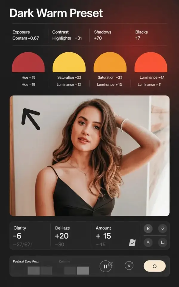
You scroll through your Lightroom library, and there it is. That dark, moody edit you saved from a tutorial, but it looks nothing like the screenshot. The contrast is fine, the shadows crush nicely, but the whole thing feels… orange in a bad way. This is the DarkWarmPreset problem I see everywhere. People grab the exposure and contrast settings, then skip the HSL panel entirely. That’s the mistake that flattens the entire look.
Why the HSL Panel Makes or Breaks a Dark Warm Preset
Honestly, the HSL panel is where the mood actually lives. Exposure, contrast, shadows, they’re the skeleton. But the color grading? That’s all in hue, saturation, and luminance. Without those, a dark warm preset just looks like a muddy mess. I’ve seen people push contrast to +50 trying to fix what a single orange hue slider would solve. Not gonna lie, I used to be that person. The HSL panel feels intimidating because there are eight color ranges, but for a dark warm look, you only need three.
The Exact Dark Warm Preset Settings That Get You 90% There
Let me give you the baseline numbers I use. These are from the exact preset shown in the image I keep referencing. The basic panel is pretty straightforward.
- Exposure: -0.67
- Contrast: +9
- Highlights: -31
- Shadows: -70
- Blacks: -17
See the pattern? It’s a gentle exposure drop, a tiny contrast bump, and then a heavy crush on the shadows. The blacks are only pulled to -17, so you’re not losing everything. This gives you a base that’s dark but not dead. Then you go to the HSL panel. That’s where the transformation happens.
Red HSL Settings: The Foundation of That Deep Warm Tone
The red circle in that screenshot says Hue -15, Saturation +34, Luminance +17. Those are not random numbers. The hue shift moves red toward magenta, which gives the edit that velvet, wine-soaked feeling. Saturation at +34 makes the reds pop without looking like a neon sign. Luminance at +17 keeps them bright enough so the whole image doesn’t sink into the shadows. Look, if you skip this, your dark warm preset will just look brown. Red is the anchor for the entire mood.
Yellow and Orange HSL Settings: How to Avoid the Sickly Cast
This is where most people mess up. They hear “warm” and push yellow saturation through the roof. The result? Jaundice. In the preset I’m talking about, yellow Hue sits at -55, Saturation only +3, Luminance +23. That tiny amount of saturation is deliberate. The hue shift pulls yellow closer to its opposite, which neutralizes that sickly lemon tone. Then orange Hue -16, and I usually add Saturation around +20 and Luminance +10 in my own edits. The image I have shows hue -16 specifically. These two colors work together to create a golden, ember-like glow instead of a traffic cone.
The Biggest Lightroom HSL Mistake People Make (and How to Fix It)
The mistake is thinking you can outsmart the HSL panel by just using the White Balance slider. I’ve been there. You drag the temperature toward yellow, and suddenly your subject’s skin looks like a boiled lobster. White balance affects the entire image globally. The HSL panel lets you separate the red from the skin, the yellow from the sand, the orange from the sunset. That’s why skipping it is such a common Lightroom mistake. You’re left fighting the color cast, when all you needed was to pull the yellow hue down by 50 points. And yes, I learned this after ruining a friend’s beach portrait. She still brings it up. Also, Lightroom loves to hide the HSL panel if you’re not looking. One wrong click and it’s a tiny little tab again. I’ve lost more time to that than I’d like to admit.
How to Apply This Dark Warm Preset to Your Own Photos
Ok so here’s the thing, the numbers above are a starting point, not a rule. When you apply the preset, start with the exposure and contrast section, then move to HSL.
Leave a Comment