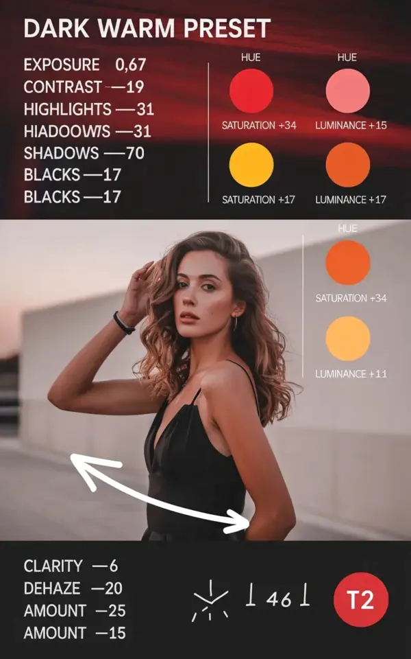
You’re sitting there staring at a portrait that looks technically fine, but it’s missing that cozy, cinematic pull. Maybe the colors feel flat, or the mood is just… off. This dark warm preset guide breaks down the exact Lightroom settings to fix that, using nothing but the free version of Lightroom and a little patience. The budget angle here matters, because you don’t need to drop fifty bucks on a preset pack to get that rich, moody atmosphere. You just need these numbers and a few minutes.
## Exact Dark Warm Preset Settings for Lightroom (Write These Down)
Ok so, let’s get straight to the point. Here’s the full breakdown for the base exposure and tone curve adjustments:
- Exposure: -0.67
- Contrast: +9
- Highlights: -31
- Shadows: -70
- Blacks: -17
Then, the color grading circles. For the red channel: Hue -15, Saturation +34, Luminance +17. For yellow: Hue -55, Saturation +3, Luminance +23. For orange, the circle shows Hue -16, and you’ll usually pair that with a small saturation bump, around +10 to +15, depending on your image. These are starting points, not gospel. Write them down, then tweak.
## Why Exposure -0.67 and Contrast +9 Make the Base Look So Different
The negative exposure isn’t just about making the photo darker. It’s about creating a quiet, intimate space in the frame. By pulling down only 0.67 stops, you keep the image natural while gently pushing everything into shadow. Then the contrast at +9 adds just enough separation without making the photo look crunchy. Honestly, if you crank contrast on a dark image, you’ll lose all the softness that makes this preset feel warm. That’s why this pairing works so well: one pulls back, the other adds a touch of depth.
Most people skip the contrast because they think a dark preset means a flat curve. That’s a mistake. Without that +9, the image can look like a grey haze. With it, you get definition in the hair and the edges of the face, but not so much that you’re seeing pores and texture that would ruin the mood.
## Highlights, Shadows, and Blacks: The Mood That Comes From the Details
Highlights at -31 is a serious move. It tames any bright windows, white walls, or specular highlights on skin that would otherwise dominate the frame. The shadows at -70 do the heavy lifting for the dark, cozy aesthetic. That’s a big drop, and it’s what gives the image that low-key, candlelit vibe. Blacks at -17 is the subtle finisher, it stops the deepest areas from becoming pure black voids, so you still see detail in dark clothing or shadowed hair.
Here’s the thing: if you just set exposure and leave the rest, you’ll get a flat, uninspired result. The shadows and highlights are what give the photo its weight. I learned this the hard way. My first attempt at this preset made my cat look like a burnt lump of charcoal. Took me twenty minutes to figure out that my blacks were too low. So, trust the -17, not lower.
## Red, Orange, and Yellow Color Grading: The Secret to Warm, Cinematic Skin Tones
Now for the fun part. The red circle settings: hue -15 shifts red toward a deeper, rusty tone, while saturation +34 brings out all that rich warmth in lips and cheeks. Luminance +17 lifts the red channel just a touch, so the face doesn’t get muddy. The yellow adjustments are more dramatic: hue -55 is a massive swing toward orange, which is why it works. This is what gives that golden, honey-like glow. Saturation +3 is small, but it’s enough to enhance the warmth without turning skin into a fake tan. Luminance +23 brightens the yellow parts of the image, which usually means the highlights on skin and the background light.
The orange circle shows hue -16, which gently pulls orange toward red. This is your safety net. It keeps skin tones from going too sickly or synthetic. My cat, again, came out looking vaguely radioactive after my first try. I had the yellow saturation too high. Dial it back, and the portrait will feel warm, not burnt. That’s the balance you’re chasing.
## How to Get These Dark Warm Preset Settings Without Spending Money
Let’s talk budget, because I know presets can be stupidly expensive. A single “cinematic” preset pack can run you thirty or forty dollars, and honestly, most of them are just the same sliders you already have access to. Use the free Lightroom mobile app or the free version of Lightroom desktop. The HSL panel is fully available in both. You can also save these settings as your own custom preset after you dial them in, so you never have to buy anything again.
To do that, just apply the settings to one photo, then click the “+” button in the Presets panel and name it something like “Dark Warm DIY.” Now you have a preset you made yourself, for free, and you know exactly what’s in it. If a paid preset breaks in a future Lightroom update, you’re out of luck. If your own preset breaks, you just fix the one slider.
## Troubleshooting Your Dark Warm Look: Common Mistakes and Fixes
If your image looks muddy and flat, your shadows may be too far down. Raise them from -70 to around -50 and see if that helps. If everything looks too orange, pull the yellow hue back from -55 to -35. You’ll lose some of that golden glow, but you’ll keep it from looking overdone. And if skin tones look grey, check your orange luminance. That orange hue of -16 needs a positive luminance, around +10, to keep the face pop.
One more thing: this preset works best on images with natural light. Flash photos with harsh backgrounds will fight the warm grading, so you might need to drop the contrast even lower. Honestly, this is a preset you want to use on a day when the sun is already low. That’s the honest truth. It’s not a magic button, it’s a starting point.
So there’s the complete dark warm Lightroom recipe, no expensive products required. Try it on your next portrait session or a moody lifestyle shot, then adjust from there. If you want more breakdowns like this, I’ve got other settings guides below. Save this one for your next edit, seriously, it’ll save you the guessing.
Leave a Comment