Getting Started with a Dark Warm Preset Look
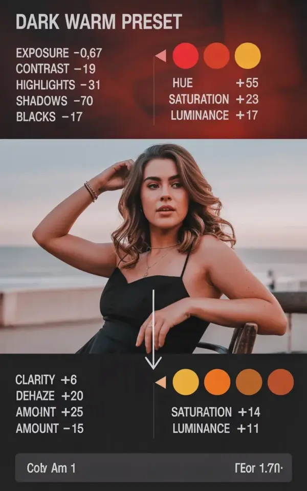
If you have been scrolling through photography feeds and wondered how some images feel both cozy and dramatic, the answer is often a simple dark warm preset. I remember the first time I saw that moody, golden tone – it looked complicated, but it is really just a few slider moves. A dark warm preset tweaks exposure and color hue settings to give your photos that rich, candlelit vibe without making them look flat or muddy. This guide breaks down the exact numbers you will use, starting with exposure at minus 0.67 and contrast at plus 9, along with specific red, orange and yellow adjustments. Whether you are editing portraits, food shots or street scenes, these settings create a consistent, warm atmosphere that stands out.
Understanding Exposure and Contrast for a Moody Feel
Exposure and contrast are the backbone of any preset. For a dark warm preset, you want the overall exposure slightly underexposed so the image feels intimate. That is why the exposure slider sits at minus 0.67 – it drops the brightness just enough to keep details in the highlights while letting shadows sink. Then you add contrast at plus 9. This small bump increases the difference between light and dark areas, making the photo pop without looking harsh.
Many beginners worry that lowering exposure will lose detail, but that is where the other sliders come in. The shadows slider gets pulled down to minus 70, which deepens the darker parts of the image and removes any flat grayness. Blacks at minus 17 tighten the lowest tones, giving the photo that rich, deep foundation. Together, these four numbers create the base for a moody dark warm preset. If your photo already has strong light and dark areas, you might need to adjust slightly, but these values work well for most natural light shots.
Fine Tuning Highlights and Shadows for Depth
Highlights are often the trickiest part of a dark warm preset because you do not want to blow out bright areas or make them look dull. In the guide image you will see highlights set at minus 31. That pulls back the brightest parts of your photo, like a window or a shiny surface, so they stay soft and warm rather than white and glaring. Combined with the deep shadows at minus 70, this creates a balanced range where the eye moves from gentle light to rich darkness.
Let me give you a real example. If you are editing a portrait taken near sunset, the sky might be bright while the subject’s face is in shadow. With highlights at minus 31, the sky becomes a warm, muted gold. The shadows at minus 70 then make the darker parts of the image (hair, shaded clothing) feel deep and cozy. The result is a natural, filmic look that does not scream “overprocessed.” Remember, these numbers are just a starting point – you can nudge highlights up or down depending on your specific photo.
Red, Orange and Yellow: The Secret to Warm Skin Tones
Color is what makes a dark warm preset feel alive rather than just dark. In the preset guide you will see three circular adjustment indicators, each for a specific color. Red gets hue at minus 15, saturation at plus 34 and luminance at plus 17. This shift makes reds deeper and slightly more intense, which is great for lips, sunsets or any warm accents. Orange follows with hue at minus 16, saturation plus 3 and luminance plus 23. That small hue shift pushes oranges toward red, and the luminance bump brightens the skin without making it look washed out.
Yellow is where the magic happens for a warm tone. The guide shows yellow hue at minus 55, saturation at plus 3 and luminance at plus 23. That huge hue shift turns yellow into a golden orange, removing any greenish or pale yellow cast. If you have ever had a photo look sickly or too cool, this yellow adjustment is the fix. For skin especially, keeping orange and yellow luminance slightly higher than red luminance helps the face stay bright while the rest of the image stays moody. Experiment with these three colors and you will see how a dark warm preset can transform a flat image into something that feels like a late afternoon glow.
How to Apply These Settings in Lightroom (Desktop and Mobile)
You do not need to be a Lightroom expert to use these numbers. On the desktop version, open your photo and go to the Develop module. The basic panel is where you adjust exposure, contrast, highlights, shadows and blacks – just type in the values exactly as shown. Then scroll down to the HSL/Color panel. Click on the Hue tab, then drag the red, orange and yellow sliders to the positions given. Do the same for Saturation and Luminance tabs.
On the Lightroom mobile app, the controls are similar. Tap the light icon to access exposure and contrast. Then tap the color icon and select Mix to find the hue, saturation and luminance sliders for each color. If you want to save these as a preset for future edits, click the three dots in the top right and choose “Create Preset.” Name it something like “Dark Warm Preset” and include only the light and color settings. This way you can apply the whole look with one tap on your next batch of photos.
Common Mistakes When Using a Dark Warm Preset
Since you are new to this, let me save you some frustration. The biggest mistake is applying the same preset to every photo without adjusting. Exposure minus 0.67 might be too dark for an already dim indoor shot, and contrast plus 9 could crush details if the original photo is flat. Always check your histogram: the graph should not pile up on the left (too dark) or right (too bright). Another mistake is overdoing the red saturation. Plus 34 is strong – if your subject has red skin blemishes or a flushed face, back the red saturation down to plus 20 or lower.
Also, watch out for yellow hue minus 55 turning green leaves into orange mess. That setting works beautifully for warm skin and golden sunlight, but if you are editing an autumn landscape, you might want to keep yellow hue closer to minus 30. The point is to use these numbers as a guide, not a rule. The dark warm preset guide is a starting point you can tweak for your own style. I keep a checklist nearby when I edit:
- Check exposure first – adjust if the main subject is lost in shadow.
- Look at skin tones – orange and yellow should feel natural, not cooked.
- Make sure highlights are not completely blown out.
- If the image feels too red overall, lower red saturation slightly.
- Save your favorite versions as separate presets for different lighting.
Why This Preset Works So Well for Portraits and Food
The dark warm preset really shines with subjects that have natural warmth. For portraits, the combination of lowered exposure and deep shadows flattens skin imperfections and adds a timeless, editorial feel. The red and orange adjustments give lips and cheeks a healthy flush without looking fake. I use it for indoor portraits with window light, and it instantly makes the photo feel like a movie still. For food photography, the warm tones make bread, coffee, caramel and roasted vegetables look richer and more appetizing. The slightly underexposed look hides harsh table reflections and focuses attention on the food itself.
Even if you photograph landscapes, this preset can work for golden hour shots or forest scenes with warm bark and fallen leaves. Just remember to watch the greens – you might need to adjust the yellow or green hue separately because the preset is designed to push yellows toward orange. For a typical landscape, try reducing the yellow hue shift to minus 30 and lowering red saturation to plus 20. That keeps the moody feel without turning trees into carrots.
Saving the Preset and Building Your Own Variations
Once you have dialed in these numbers on a photo you like, saving the preset is smart. In Lightroom Classic, click the plus sign next to Presets in the left panel. Select “Create Preset” and check only the settings you changed – under Light, check Exposure, Contrast, Highlights, Shadows, Blacks. Under Color, check all the HSL sliders for red, orange and yellow. Name it “Dark Warm Preset Base.” Then you can duplicate that preset and modify it for different scenarios, like “Dark Warm +1 Stop” if you need more exposure, or “Dark Warm Muted” with lower saturation.
Building variations helps you work faster and keeps your editing style consistent. After a few uses, you will develop an intuitive sense for how much to push the sliders. That is the real goal of this guide – not to give you a one-size-fits-all number, but to show you how a few targeted adjustments create that coveted dark warm preset mood. Keep experimenting, and soon you will be able to recreate the look from memory.
So next time you sit down to edit, pull up that dark red background guide from the image, put the numbers in, and see how your photo transforms. Then tweak it until it feels right for you. Save the final version as a preset and you will have your own signature style ready for any shoot. If you found this breakdown helpful, try it on three different photos this week and compare the results. That hands-on practice will teach you more than any article can.
#DarkWarmPreset #LightroomPreset #PresetGuide #EditingTips #PhotographyTutorial
Leave a Comment