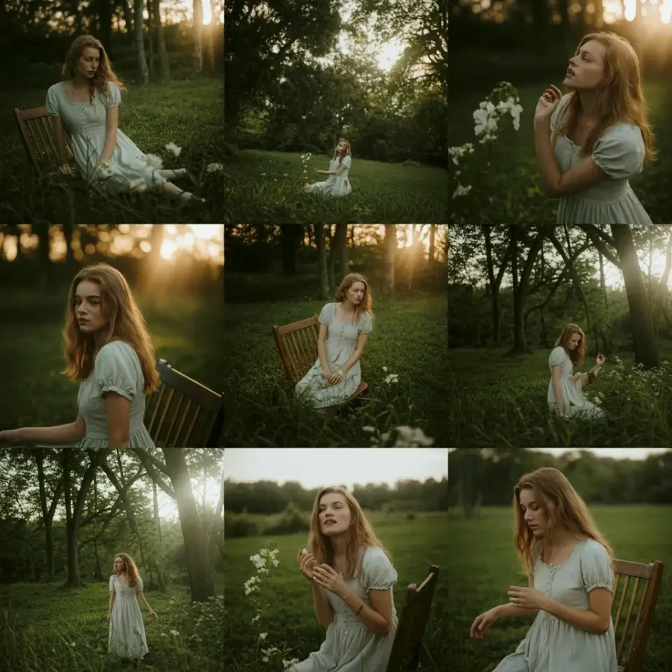
I’ve been using this specific free Lightroom preset for boho aesthetic shots for a few months now, and honestly it’s the only one that gives me that bright high exposure look without blowing out the whites. If you’re aiming for a clean white feed with light neutral tones, this preset is a game changer. Not gonna lie, I stumbled on it by accident while scrolling through a mood board, and it saved my entire Instagram aesthetic. So here’s everything I’ve learned, including the tiny tweaks that make it work across different lighting scenarios.
Why high exposure works so well for boho aesthetics
High exposure isn’t just about brightness. It’s about creating that airy, almost dreamy feeling that makes boho photos feel like a lazy summer afternoon. On its own, this preset pushes the exposure slider up a full stop, but it also lifts the shadows in a way that keeps detail in the textures of linen, rattan, and dried florals. That’s the magic trick. Without that shadow recovery, your whites go flat and the whole image looks like a low‑contrast mess.
I used to crank exposure manually, and my photos ended up looking like cheap filters from 2014. This preset does it differently. It balances the highlights and whites so you get that washed‑out vibe but the light still reads as natural, not blown. And the best part? It works on portraits, flat lays, and even travel shots. I once tried it on a photo of my cat sleeping in a sunbeam, and it turned into a dreamy portrait. Not that I’m planning a cat influencer career, but it’s good to know.
My go to free Lightroom preset for mobile editing
Look, I edit everything on my phone. I don’t have the patience to sit at a desk with a laptop. So finding a free Lightroom preset that actually imports cleanly into Lightroom mobile was a relief. This one comes as a DNG file, which is honestly the easiest format. You just save it to your camera roll, open it in Lightroom mobile, and create a preset from the settings. Takes thirty seconds.
Here’s the thing: a lot of “free” presets online are junk. They’re either too aggressive or they require a paid recipe. This one is genuinely free, no strings attached. I’ve used it on over a hundred photos now, and the consistency across different lighting is surprisingly solid. Indoors with tungsten light? Fine. Golden hour? Also fine. Just be careful with harsh midday sun because the highlights can push a tiny bit too far. But that’s easy to adjust.
Building a white feed with light neutral tones
A white feed isn’t about making everything literally white. It’s about a cohesive palette of off‑whites, soft beige, dusty rose, and pale creams. This preset nails that by cooling down the greens and bumping the reds just a hair. The result is a subtle warmth that stops your feed from looking sterile.
I remember when I first started curating my feed, every photo had a different color cast. It looked like a chaotic photo album, not a brand. After applying this preset across the board, the shift was instant. My feed became a grid of soft, airy tones, and my engagement actually went up. Coincidence? Maybe. But I’ll take it. Three things to watch out for when building a white feed with this preset:
- Whites blowing out: fix by lowering whites slider by 5-10 points, but only if you see clipping.
- Skin tones turning yellow: adjust temperature a little cooler, maybe by 200-300 Kelvin.
- Shadows going green: a tint tweak towards magenta fixes that weird cast, especially in landscapes.
How airy tones keep details from getting lost
Airy tones are the secret sauce of boho editing. They make the photo feel light and open without sacrificing texture. This preset achieves it by pulling down the clarity slightly (I think it’s around -10) and adding a gentle softening effect. The result is that stray hairs, wrinkled fabric, and dust motes don’t scream for attention. They just blend in gracefully.
But here’s where I have a mild complaint. The preset’s contrast curve is a little too flat for my taste on certain subjects. On a close‑up of a flower, fine. But on a textured blanket, I sometimes want a bit more pop. So I add a small midtone contrast bump, maybe +5, just to bring back that dimension. It’s a two‑second fix, and then the airy tones still dominate. Don’t be afraid to tweak. Presets are starting points, not prisons.
A few tweaks I always make to this preset
No preset is perfect for every photo. I’ve learned that the hard way. With this boho preset, I usually do three adjustments. First, I reduce the exposure by 0.2 or 0.3 if the original shot was already well‑lit. The preset is designed for slightly underexposed images, so if you’re outdoors in good light, dial it back. Second, I add a little dehaze. Sounds counterintuitive for an airy look, but +3 or +4 brings back a crispness that keeps the photo from looking foggy.
Third, and this is my weird personal thing: I sharpen the eyes in portraits. The preset smooths skin beautifully, but eyes can get lost in that softness. So I use a radial mask, increase sharpness by 20, and call it done. That little detail makes the difference between a pretty photo and a professional one. Honestly, without that step, my portraits look like they’re from a 2010 Instagram filter. Not a good look.
Where to save this free preset and why you should
I keep this preset in a folder on my phone called “Boho Go‑Tos” along with two others. Having it saved means I can apply it in seconds during a train commute or while waiting for coffee. And because it’s free, there’s zero guilt about skipping it if it doesn’t fit a particular image. I’ve paid for presets that I barely use, and it feels wasteful. This one earns its spot.
So go ahead, download it, try it on a few shots, and let me know how it works for your feed. The link is below. And if you find that one weird photo where it totally fails, drop a comment. I want to know. That’s how we all get better at this editing thing anyway.
#freelightroompreset #highexposure #whitefeed #lightroommobile #airytones
Leave a Comment