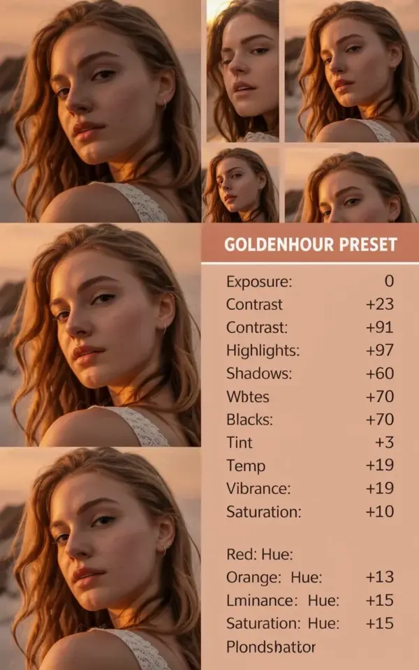
There is a specific kind of photo that makes you stop scrolling instantly. The kind where the light looks like honey, the skin glows, and the whole frame feels warm and a little bit nostalgic. I saw a collage recently that nailed this exact vibe, a grid of five portraits of a girl with long wavy brown hair, all shot in that gorgeous sunset glow. The label on the graphic read “GOLDENHOUR PRESET” in clean white text over a soft peach background, with exposure settings listed right beside it. It made me want to pack my bags and move into a permanent late afternoon. Honestly, it made me want to edit every single picture I’ve ever taken.
This post is for the beginner. For the person who has Lightroom installed but feels slightly terrified when opening the app. For the person who screenshots edits from TikTok but still doesn’t understand what the sliders actually do. Look, I have been there. I used to fiddle with the “Warmth” slider and make everyone look like a bad spray tan. So let me show you how a true golden hour preset for portraits works, what the settings mean, and how you can get this dreamy look without losing your mind.
What Exactly Is a Golden Hour Preset?
A preset is just a saved group of settings. It is a one-click recipe for editing. When you apply it, Lightroom adjusts your exposure, contrast, color balance, shadows, and more all at once. It mimics the look of shooting during golden hour, which honors the time right before sunset when the light turns soft, warm, and flattering.
Now, the important part. A golden hour preset is not a magic filter that fixes a bad photo. It’s more like a base. Think of it as a starting point that gets you 80% of the way there. It deepens the oranges, softens the highlights, and adds that sun-kissed tint to the skin. But you still need to tweak it for your specific image. Every shot is different, so the preset is a guide, not a rule. That’s what so many people get wrong when they download a preset, they apply it and wonder why it looks weird. You have to meet the preset halfway.
Why the Warm Light in the Collage Works So Well
In those five portraits, the light isn’t blasting directly into the camera. It’s wrapping around the subject. The shadows are soft, not harsh. The girl’s skin has a healthy, golden undertone, not a sweaty glow. This is because the preset enhances the peach and amber tones that are already present in warm light. It works with the photo’s natural strengths.
The background in the photos fades into a creamy blur. The highlights are pulled down slightly so the sky doesn’t bloom out to pure white. Her hair, that wavy brown hair, picks up streaks of warm reflection. This is what you want. You want the light to feel like it’s coming from a source just out of frame, casting a gentle, even radiance. It makes the portrait feel intimate, like she’s about to laugh or say something shy.
How to Apply a Preset in Lightroom Like a Pro
Ok so, if you have the preset file, you don’t need to do anything complicated. Open your photo in the Develop module in Lightroom Classic, or in Lightroom CC, just hit the Presets panel on the right side. On the mobile app, it’s at the bottom. Don’t overthink it.
Once you click the preset, you will see the magic happen instantly. But here’s the thing, don’t stop there. You should immediately check a few areas.
- Look at the eyes. Are they too dark? Bring up the shadows slightly.
- Check the skin tone. If the person looks too orange, reduce the saturation on the orange luminance channel.
- Check the background. If the grass or trees look like they’re on fire, tone down the overall warmth slightly.
I remember the first time I applied a preset and thought it looked perfect in the little preview box. Then I looked at the full-screen version and wanted to cry. The face was basically a neon orange blob. My advice? Always zoom in to 100% on the face before you decide the edit is done. You spend 10 seconds doing this check and it saves you an entire day of regret.
The Exposure Settings in the Preset (Based on the Photo)
The collage I mentioned actually shows the technical settings right on the label. That part is useful, so let’s break it down.
The preset is set to mimic an exposure of 50mm, ISO 100, and about 1/400 shutter speed. These are the kinds of numbers you would use when shooting in bright but diffused sunlight. The exposure is lifted just a touch to keep the face bright and airy. The contrast is kept gentle so you don’t lose detail in the shadows under the chin or hair.
The white balance is pushed toward yellow and magenta. That is the secret to the dreamy look, most presets just push yellows. But adding a small hint of magenta keeps the skin from looking sickly green. It adds life to the cheeks. You don’t need to memorize the exact numbers here. Just know that the balance between warmth and magenta is what makes the skin look lit from within, rather than just stained.
Customizing the Preset for Different Skin Tones
Look, I have to be straight with you. Presets created by someone else are often tested on one specific model. If you shoot poeple with deeper, richer skin tones, a generic golden preset can make them look ashy or dull. It’s a real limitation and nobody talks about it enough.
That’s why you need to understand the sliders, not just the final look. If the preset greys out the skin, go into the HSL panel. Find the Orange and Yellow sliders. Reduce the luminance slightly and add a bit of warmth back. Don’t just drag the temperature slider all the way left, that will turn the whole photo blue. You have to be surgical. On the other hand, if you’re editing someone with very fair skin, you might need to dial down the warmth a touch so they don’t look sunburned.
I once edited a series of portraits for a friend with freckles. The preset made her freckles disappear completely, which was a crime. So I pulled the Texture slider up on the face and lowered the Clarity. That kept the skin smooth but let the freckles pop through naturally. The preset is a template, but you are the artist. Remember that.
Using the Sunset Glow Effect Without Overdoing It
There is a fine line between a sunset glow and a radioactive look. I see so many photos that look like the subject has been bronzing for six hours in a tanning bed. It’s not a good look. The goal here, with this warm light aesthetic, is subtlety.
To keep it natural, focus on the split toning (or Color Grading, as it’s called in newer Lightroom). Put a little bit of orange in the highlights and a touch of blue or teal in the shadows. This creates a beautiful separation. It adds depth to the photo so it doesn’t look flat. The highlights get that golden peach color, while the shadows stay cool and grounded. It’s a classic trick that keeps the portrait looking fresh and expensive.
If you do nothing else, do this one thing. Back off the preset. Cut the opacity of the preset effect down to 60% or 70%. That simple action makes the preset look way more natural. It prevents the editing from looking like you just discovered a filter and went crazy. Do that, and your portraits will have that soft, honest, golden hour feel every single time.
The whole point of editing this way isn’t to make it obvious. It’s to make people ask, “Who took that photo?” or “What time of day was that shot?” Keep them guessing. Keep the mystery alive. The feeling is everything here, not just the technical proof.
At the end of the day, just save this post for your next warm shoot. Go play with the settings, mess around, and make mistakes. That’s the best way to learn. And when you perfect your own take on that dreamy, golden glow, I’d honestly love to see it. Post your results and tag me, or just come back and tell me how it went. Happy shooting, and go catch that golden light while it’s still out there.
Leave a Comment