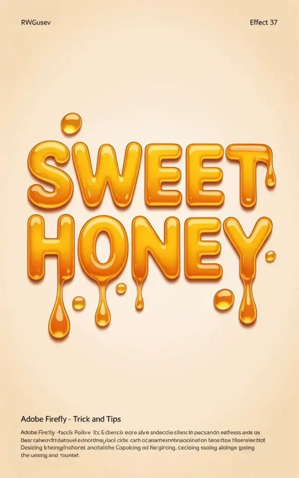
If you’ve tried a HoneyTextEffect in Adobe Firefly before, you’ve probably seen it. The drips are there, the golden color is warm, and then the result just sits there looking flat and dead. Ok so here’s the thing, the gloss layer is doing all the heavy lifting, and most tutorials skip it entirely. That’s why the “Sweet Honey” lettering in the image above works so well. It’s not just the dripping texture or the warm golden-orange glow against that light beige background. It’s the tiny highlights that make every droplet feel like actual sticky syrup and not just a clump of orange plastic.
Honestly, I’ve lost count of how many Firefly prompts I’ve run where the honey looks like melted crayons. The difference is almost always the same. You need to force Firefly to give you surface reflection. The small text in the corner of that image, the little “RWGUSEV” and “Effect 37” tags, they don’t mean much to us, but the rendering behind them is a masterclass in subtle light play. This post is a seasonal, trend-aware take on that exact look, with practical steps you can actually steal.
Why the Gloss Layer Makes or Breaks a Honey Drip
The first time I generated a honey text effect, I got something that looked like a melted candle. It had the right shape, sure. No shine, no wetness, no life. The gloss layer is what sells the material. Without it, your drips read as wax, resin, or some weird amber plastic. With it, suddenly the brain says “oh, that’s honey” in half a second.
Look at the “Sweet Honey” image again. Every drip, every curve, has a bright spot somewhere along its edge. That’s the highlight. In Adobe Firefly, you can bake that into the prompt instead of trying to paint it on afterward. The trick is using words like “wet gloss,” “liquid sheen,” and “reflective surface” early in the prompt, not as an afterthought.
Here’s a weird little aside. I was testing this on a Thursday morning while my coffee sat untouched and got cold. I must have run thirty generations, and the ones with “glossy highlights” in the beginning of the prompt all came out better than the ones with “honey text” and nothing else. That phrase placement matters more than people think.
How to Get the Golden Honey Color Right in Adobe Firefly
Honey isn’t one color. It changes from pale amber to deep burnt orange depending on the light. In the image above, the warm golden-orange tone is doing a lot of emotional work. It feels rich, cozy, and a little autumnal, which is perfect for fall branding or harvest season posts.
If you want that same palette, avoid generic terms like “yellow” or “gold” alone. Firefly responds better to specific references. Try “golden honey amber,” “warm caramel orange,” or “translucent orange syrup.” The word “translucent” is important because it tells the model that light passes through the material. That’s a huge part of making it look edible.
- Lead with the color phrase, then follow with the texture phrase.
- Keep the beige background simple so the letters pop.
- Add “small scattered droplets” if you want the messy detail look.
A Firefly Tutorial for the 3D Dripping Honey Effect
Let me walk you through the exact workflow I’d use to recreate the “Sweet Honey” style. Start with your text. If you’re using Firefly’s text-to-image, you have to write the word in the prompt itself. I’ve found that putting “the word Sweet Honey spelled in dripping honey” works better than just “honey font.” You want the model to understand that the letterforms are the main subject, not a graphic design overlay.
The 3D effect comes from combining “three-dimensional” with “beveled edges” and “soft rounded corners.” You don’t want sharp, cut-out lettering. Real honey is thick and blobby. And for the love of all that is sticky, don’t forget the small droplets. Those tiny dots floating around the text in that image are what make the whole composition feel dynamic. They break the symmetry and add motion.
A simple prompt structure that worked for me is this. “The word Sweet Honey in thick glossy dripping honey text, 3D, warm golden orange, small scattered droplets, light beige background, soft studio lighting, high detail.” Then run it a few times. DigitalDesigner folks call this prompt engineering, but it’s really just describing something like you’d explain it to a friend who’s never seen honey before.
What the Small Print Tells You About Firefly Generations
You probably noticed the tiny “RWGUSEV” and “Effect 37” text at the top of the reference image. That’s a watermark or a label from a template pack, not part of the design itself. But here’s a fun observation, those little gray letters are a good reminder that Firefly often sneaks in random micro-text when you don’t ask for it. If you see odd characters floating around, just remove them with a healing brush or crop them out.
It’s also a helpful sanity check for realism. Real honey scenes don’t have random alphanumeric codes in the corner. So if your generation looks too clean or too artificial, check for those tiny artifacts. They’re a clue that the model focused on the text prompt more than the physical environment.
Seasonal Design Ideas for Honey Lettering This Year
Honey text isn’t just a summer thing. The warm golden-orange palette works perfectly for autumn harvest campaigns, Thanksgiving menus, and cozy bakery branding. Right now, with everyone leaning into warm, nostalgic visuals on social media, this effect feels fresh again. I’ve seen it used on product packaging mockups, recipe cards, and even as a wedding sign for an outdoor fall ceremony.
The gloss layer is what separates a cheap clip-art look from something you’d actually pay a designer for. If you’re a freelance creative, try pairing this effect with slow-motion style shots of real honey being poured. Or just use the Firefly rendering as a starting point and then add your own highlights in a photo editor. That’s honestly the move sometimes.
How to Use Small Droplets Without Clogging the Design
There’s a fine line between “scattered droplets” and “messy chaos.” In that reference image, the small droplets are placed near the letterforms, not exploding across the whole canvas. That’s a deliberate compositional choice. You want the eye to follow the drips downward, like the honey is still moving.
If you’re working in Adobe Firefly, you can control the density by adding phrases like “sparse small droplets” or “a few droplets around the letters.” Test both. Sometimes the model gives you too many, sometimes too few. Also, keep the droplets the same color family as the main text. A droplet that’s too dark or too light will pull attention away from the lettering. The beige background in the reference image keeps everything calm so the glossy orange remains the hero.
Don’t Skip the Final Highlight Pass
Even after Firefly gives you something good, spend one minute adding an extra highlight dot or two. Not gonna lie, I do this in every single honey project. It’s usually the difference between “nice AI image” and “wait, that’s actually a photo of honey?”.
Use a soft white brush at low opacity, maybe 20 to 30 percent, and tap it near the top edges of the drips. You don’t need a pen tablet or fancy filters. Just a few small white spots with low opacity. Then blend it with a smudge tool or a soft eraser. That two-minute step has saved me more designs than I can count. The honey effect in Adobe Firefly gives you the structure, but the gloss layer is what gives it a soul.
Anyway, that’s my full take on this look. Save this post for your next seasonal project, and don’t skip the highlights. The next time you’re tinkering with Firefly, add a few extra reflections and see what happens. I think you’ll be surprised by how much more real it feels. 🍯
#HoneyTextEffect #AdobeFirefly #HoneyEffect #DigitalDesigner #FireflyTutorial
Leave a Comment