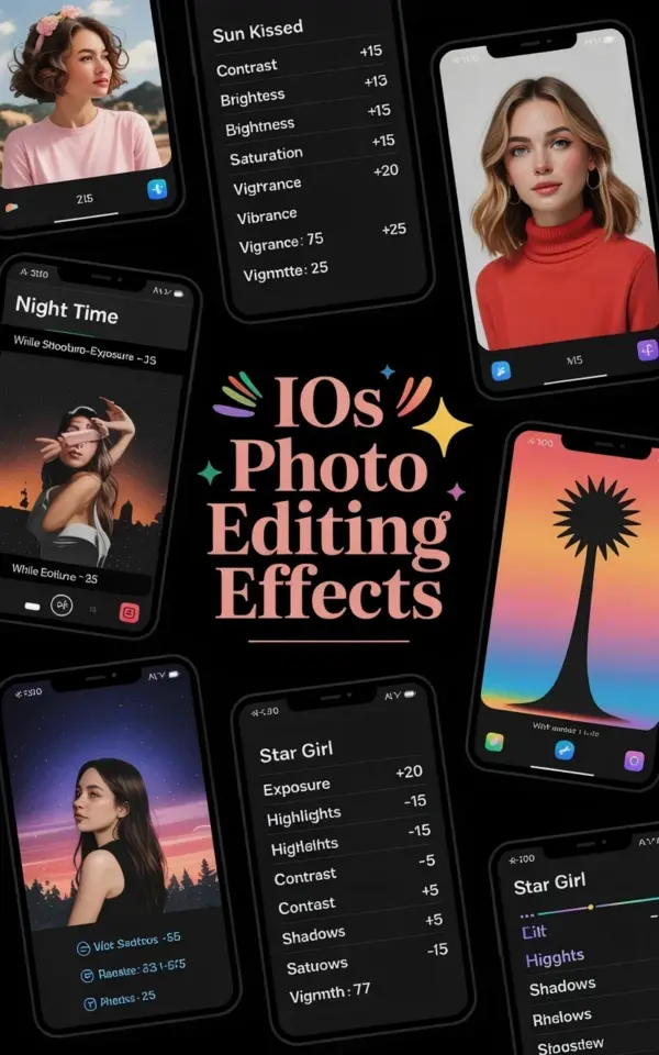
Why Your Sun Kissed Edits End Up Looking Like a Bad Filter
You found the iOS photo editing effects in your camera roll settings, right? That little panel with the sliders I accidentally ignored for months. Look, I’ve been there: you bump contrast to +15, brightness to -10, saturation to +15, like the Pinterest note says, and suddenly your face looks orange and your white shirt is neon. The problem isn’t the preset itself. The problem is that most people apply those numbers to every single photo without thinking about the original lighting. And that’s mistake number one.
Honestly, the sun kissed look works best on photos taken in flat, even light. Not harsh midday sun. Not a dim living room at 11 p.m. If you try to force that warm glow onto an already bright beach shot, you’ll just fry all the highlights. I did exactly that with a picture from my sister’s brunch and ended up looking like a deep-fried meme. The fix is simple: before you touch those sliders, ask yourself: is the base exposure close to neutral? If not, adjust brightness first, then apply the preset as a starting point, not a final recipe.
Another mistake: ignoring vibrance. The photo in the collage shows “Vibrance: +20” right under the saturation setting. But lots of people just boost saturation and call it done. Saturation hits all colors equally, including skin tones. Vibrance is smarter. It protects your skin from turning into a Cheeto. So keep that vibrance slider handy. Use saturation to +15 only if you want the leaves and sky to pop, but then dial vibrance up to balance it. Otherwise you’ll lose all nuance. Yeah, I’m that person who edits a single flower shot for twenty minutes.
The Night Time Mistake That Kills the Vibe
Now the night time look. The collage says “While shooting-expo” – I think they meant exposure while shooting, but whatever. The key is low exposure. But here’s the mistake: people drop exposure too aggressively and then wonder why the photo is just a black rectangle. They also forget that “night time” doesn’t equal “no details.” You should see the sky, some shadows, maybe a streetlamp glow. Not a void.
Ok so here’s what I do. Start by lowering exposure in the native iOS editor to around -20 or -30, but check the histogram. If the graph smashes against the left edge, you’ve gone too far. Bring it back. Then bump contrast just a little, say +10, to keep the blacks from looking muddy. The night time effect should give you moody vibes, not a crushed mess. And please, do not touch the saturation slider for night shots. Leave it at zero or even negative. Moody means desaturated. Warm, not colorful. Trust me, I learned this after posting a night skyline that looked like a radioactive disco.
That Vignette Setting: Too Much or Too Little?
In the sun kissed preset on the photo, there’s a vignette value of 25. That’s a solid middle ground. But people often crank vignette to 50 or 75 because they think it looks cinematic. It doesn’t. It looks like you’re peering through a toilet paper tube. I’ve seen it. I’ve done it. My early Instagram feed was a series of dark corners and confused followers.
The trick: treat vignette as a subtle framing tool, not a dramatic effect. For a sun kissed portrait, 15 to 25 is plenty. For night time, you can go a little higher, maybe 30, because dark edges actually help the eyes focus on the lit areas. But if you can see the dark ring as a distinct circle? Too much. Back it off until it feels like a natural shadow falloff. Honestly, I usually start at 0 and slowly slide up until I feel a gentle darkening, then stop. That’s it. No magic number. The collage gives 25 as a suggestion, but your photo might need 10 or 40. It’s not cheating to break a preset.
Common Preset Trap: The “One Size Fits All” Mentality
I get it. You found a perfect preset, you saved it, and now you want to apply it to every photo from that trip. Big mistake. The sun kissed effect with contrast +15, brightness -10, saturation +15 was designed for a specific lighting condition. Apply it to a photo taken indoors under warm tungsten bulbs? You’ll get a yellow disaster. Apply it to a rainy day shot? Mud city.
Here’s a better workflow, broken into three quick steps (not all equal, because life isn’t equal):
- First, duplicate the original photo so you can always go back. I’ve learned this the hard way after deleting the unedited version.
- Second, use the preset as a base, but adjust brightness first. If your original is already bright, lower the preset’s brightness even more. If it’s dark, raise it. That single tweak fixes 70% of preset fails.
- Third, check skin tones. Zoom in on a face (or a hand, or a pet). If the skin looks unnatural, reduce saturation and increase vibrance. The pet thing? My cat Milkshake looks terrible with +15 saturation. She gets a weird orange tint. So I keep her at +5 saturation max.
That’s the honest truth. Presets are maps, not magic spells. Use them as starting points, not final destinations. And honestly, some of my favorite edits are just a tiny tweak away from the original. Not everything needs to be “stunning.” Sometimes it just needs to look like real life, but a little warmer.
How to Avoid the “Instagram Filter” Look
You know the look I mean. The one where every photo has the same blown-out highlights, same teal shadows, same fake warmth. It’s everywhere. And weirdly, it’s often created by people using these very iOS editing effects incorrectly. Here’s the thing: the sun kissed preset can produce that fake look if you also bring down brightness too much and crank saturation. You end up with a photo that looks like it was shot through a honey jar.
To avoid that, pay attention to the whites and highlights. In the native iOS editor, you can actually adjust highlights separately. For a sun kissed effect, I drop highlights by about -10 to prevent blown-out skies, and then add warmth by +5 (like the preset suggests). That gives the glow without the glare. The night time effect? Raise shadows a tiny bit. Like +5. This brings out hidden details without ruining the dark mood. It’s a subtle move that separates a pro edit from a messy one. I’m not a pro, by the way. I just make a lot of mistakes so you don’t have to.
The Little Settings People Skip (and Regret Later)
Look at that photo again. There’s a “Warmth: +5” in the sun kissed block. So many people ignore warmth and just crank saturation. But warmth is the golden ticket. Saturation makes everything more intense; warmth shifts the color temperature. For a sun kissed look, +5 warmth is perfect. Too much and you get a sepia nightmare. Too little and it’s just a normal photo with some contrast. The mistake? Treating warmth as optional. It’s not. It’s the difference between “nice photo” and “that beach day vibe.”
Another skipped detail: the “While shooting-expo” note for night time. People forget that the effect starts in camera. If you take a pitch-black photo, no amount of editing will save it. So before you shoot, tap to expose on a brighter part of the scene. Or if you’re on an iPhone, use the exposure slider (the little sun icon) and drag it down slightly. That gives you a darker starting point with preserved detail, rather than trying to force darkness after the fact. Seriously, it’s easier to darken a well-exposed photo than to brighten a muddy one. I learned that after spending an hour trying to salvage a night shot of a cat that looked like a shadow blob. Milkshake never forgave me.
Wrapping This Up (With a Real World Test)
So next time you open up those iOS photo editing effects, don’t just blindly tap the numbers. Think about where the photo was taken, what the light looked like, and whether that sun kissed preset or night time setting actually fits. Use the collage as a cheat sheet, not a church bible. Adjust contrast, brightness, saturation, vibrance, warmth, and vignette based on what you see, not what a screenshot says. I promise your photos will start looking more like you and less like a factory filter.
Give it a try. Grab your own camera roll, pick a photo that didn’t turn out quite right, and apply these tweaks with the common mistakes in mind. Then tell me how it goes. I’m genuinely curious if your cat also ends up orange.
#iosphotography #phototips #editingeffects #presets #instagramtips
Leave a Comment