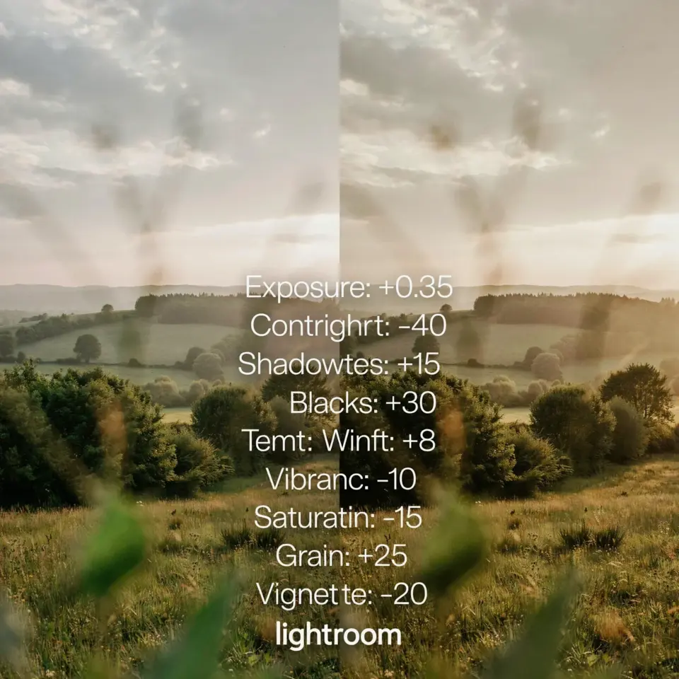
You don’t have a Lightroom problem. You have a nature photo editing mistake that’s making every single forest, meadow, and mossy rock look like a radioactive swamp. I see it constantly in photography groups. Someone nails the composition, gets the exposure right, and then they slide the saturation slider up to plus 40 and call it a day. The greens start screaming. The image becomes a neon sign. And the natural beauty you actually stood there to capture is gone, replaced by something that looks artificial and flat.
That’s the nature photo editing mistake that’s ruining your Lightroom looks. It isn’t just about saturation, though. It’s a whole cluster of over-corrections that stack on top of each other. The good news? You can fix all of it in about ten minutes. It just takes a different mindset about what makes an outdoor image feel alive.
Why high saturation ruins the natural look in outdoor photography
Saturation is a blunt instrument. It doesn’t just make colors more vibrant. It pushes every pixel in the frame toward its most extreme version, which means you lose all the subtle shifts in tone that tell the truth about a scene. Look at a real aspen forest in the fall. The yellows aren’t uniform. Some leaves are pale gold, some are deep amber, and some still carry a hint of green. A +30 saturation slider makes all of them the same screaming yellow. The image becomes louder but less interesting.
Honestly, I’ve done this to my own photos more times than I want to admit. I’d think I was making the image pop, and all I was doing was flattening out the very tones that had caught my eye in the field.
The truth is, we chase saturation because we’re afraid the photo looks flat straight out of camera. And sometimes it does. But the fix isn’t to crank color. The fix is to use contrast and light to build depth. That’s where the magic actually lives.
Use a gentle contrast bump before touching the color sliders
Here’s the thing I wish someone had told me years ago: a raw file is supposed to look dull. That flat, lifeless image you see in the develop module is a starting point, not a finished product. Before you so much as look at the saturation slider, try a small contrast increase. Somewhere around +10 or +15 is usually plenty. You’ll immediately see the image gain a little punch without any color shifting.
Then adjust the whites and blacks. This is where a lot of nature photographers overlook the power of targeted tweaks. Pushing the whites up to around +20 and pulling the blacks down to maybe -15 separates your subject from the background. It creates depth. Just be careful not to crush your shadows into black holes. You still want detail in the bark of that tree or the fur of that elk.
So the order matters. Contrast first. Color second. If you do it the other way, you end up overcompensating with saturation to fix a problem that wasn’t even a color problem to begin with.
How to fix white balance to fix the greens in your Lightroom presets
Ok so, here’s a scenario I see all the time. Someone is testing Lightroom preset ideas they downloaded, and the preset makes the whole forest look blue and cold. So they push the temperature slider warm, and now the image looks orange and the greens look sickly and yellow-brown. They never fix the tint slider, which is a huge missed step. That’s the one that actually controls whether your greens look natural or like they’re dying.
The tint slider is your green and magenta balance. A lot of nature photos benefit from a slight shift toward green, maybe +5 or +7. It counters the magenta cast that often sneaks into shadowed woodland scenes. This works especially well when you’re shooting in deep forests where the ambient light has a purple hue bouncing around from the sky.
Try adjusting temperature and tint together. Set the temperature to make the scene feel neutral, then use tint to fix the greens before you ever touch any color sliders. This will improve your nature photo editing workflow more than almost anything else you can do. It’s a small change that makes a huge difference in how natural the foliage looks.
Why Lightroom preset ideas fail when they rely on heavy color shifts
There’s nothing wrong with using presets. I use them myself, honestly. But most of them are designed for portraits or city scenes. The presets that make a model’s skin look creamy will make your mountain meadow look like a Martian landscape.
I was testing a preset once and watched it turn a perfectly good waterfall shot into a golden-brown mess. It looked like the water was made of maple syrup. That’s when I realized most presets are too heavy-handed for nature photography. The preset ideas that work best for outdoor shots are the ones that focus mostly on contrast and clarity, not on colored toning curves.
If you want to use presets, apply them and then immediately dial the overall opacity down to 60% or 70%. This is a great habit to get into. You get the structure and mood of the preset without the extreme color cast destroying your original image. Honest to god, this one tip will save you so much frustration.
When you test a preset, ask yourself one question: does it make the light look better, or just make the colors louder? If the answer is the second one, delete the preset and move on. Find another one or build your own by saving just the contrast and detail adjustments.
Use selective editing for selective whites and natural color
The adjustment brush is your best friend for making nature images look professionally edited without looking processed. Point your brush at the waterfall and add a bit of exposure and whites just to the water. That makes the water look bright and clean without blowing out the entire scene.
You can also use the radial filter to help here. Lightly darken the edges of the frame down by about -0.3. This can direct attention to your subject and also adds a subtle vignette that helps your final look feel complete. It’s a classic landscape photo editing trick that never goes out of style, and for good reason. It works.
Here are a few other tips to keep your colors honest:
– Use clarity at a modest setting, like +8 to +12, to enhance texture without making things look crunchy or over-processed.
– If the sky is blown out but the foreground is good, try the linear gradient filter to bring back blue tones, or lower highlights aggressively on just that part of the frame.
– Experiment with the hsl panel to slightly decrease the luminance of greens. This one tweak can tame a lot of the neon look that comes from a slightly overexposed shot.
– And get rid of that haze with dehaze, but use it carefully. +12 dehaze can work magic on a foggy mountain morning. +40 creates a look that may not feel very natural.
Preserve the natural mood and keep your base settings subtle
Let me tell you something maybe a bit weird. You know the grainy, dusty look you get on a really hot day when you’re driving through the desert? There’s a light quality to it that photos of desert scenes just need in order to feel right. That’s what the mood is, and your basic editing should keep that intact. You shouldn’t try to edit out the atmosphere that made you stop and take the photo in the first place.
What I mean is, the best images are the ones that transport you back to the exact moment you were standing there. The feelings of the air, the quiet, the pressure of the light. If you edit out all the atmosphere and crank everything until it’s perfect and vivid, you lose that memory and the story behind it.
Keep your base natural. Adjust exposure until it feels right, correct the white balance, bump the contrast slightly, and then really, truly stop your workflow there for a moment. Look at the image. Sit with it. See if it feels like the place you remember. If it does, you’re pretty much done. Resist the urge to keep tinkering with the saturation because that’s where things go wrong.
Conclusion and a nudge in the right direction
The nature photo editing mistake that gives away an amateur isn’t about skill. It’s about restraint. Every time you make a big change, ask yourself whether it helps the viewer see the scene the way you did. If it doesn’t, undo it. That’s the whole secret. The best nature photography is a quiet enhancement of what was already there.
So go open your latest forest shot. Try the contrast bump and the tint fix before you touch anything else. And hey, alongside your next edit, why not save this post as a reminder for your future self? It always helps to have a checklist when you’re in the middle of a whole batch of photos. Just take it one image at a time. You’ve got this.
Leave a Comment