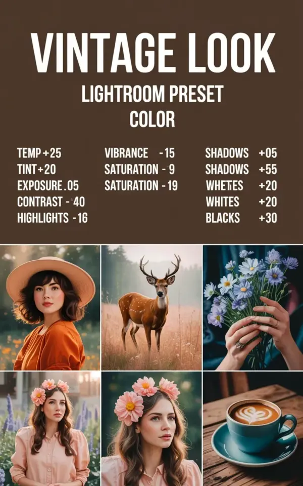
Ok so you’re in Lightroom, staring at a photo that looks sharp but lifeless. You drag the temperature slider a little to the right. Then you keep going. That’s the moment this whole vintage thing clicks. The image in this tutorial shows a simple brown backdrop with all the key numbers right there: temp +25, contrast -40, shadows -55. It’s not hidden behind layers of “secret sauce.” It’s just math, laid out honestly, and you can copy it in two minutes if you know where to click.
That’s what I love about this specific vintage look lightroom preset. It gives you that warm, cozy film vibe without needing an expensive plugin or a bunch of faded film scans. The six sample squares below the settings show exactly what it does to real images. One of them looks like a soft golden afternoon. Another one has that gentle, sunlit haze that makes me want to pour a cup of coffee. Best part? You don’t need to guess anything, because every setting is right in front of you.
What Exactly Goes Into a Vintage Look Lightroom Preset?
Honestly, most “vintage” presets are just a combination of warmth and reduced contrast. The photo you’re looking at takes that idea and pushes it in a very specific direction. Temp goes up by 25, which makes everything feel like it’s bathed in late afternoon light. Tint also goes up by 20, adding a subtle pink-magenta cast that takes away that sterile digital green you often get from modern cameras.
Contrast is dropped by 40, and that’s the big one. When you kill contrast, you lose that harsh edge. Highlights fall by 16, which protects the bright parts of your photo from blowing out. Shadows go way down by 55, which might sound counterintuitive, but it actually deepens the dark areas into a soft, smoky tone instead of leaving them flat. Whites go down a little too, and blacks rise by 30. All together, it’s a gentle, creamy tone curve that feels like an old film negative, not a harsh digital file.
The Full Settings Breakdown for This Warm Film Tone
I’m not gonna lie, I’ve bought presets before and then spent twenty minutes trying to reverse-engineer them. This one saves you the trouble. Here’s the exact list from the image, written out so you can follow along without squinting at a screenshot:
- Temp: +25
- Tint: +20
- Vibrance: +5
- Saturation: +9
- Exposure: -0.05
- Contrast: -40
- Highlights: -16
- Shadows: -55
- Whites: -20
- Blacks: +30
Now, let’s be real for a second. You can punch these numbers in exactly as written and get a decent result. But here’s the thing: every photo is different, so the preset is a starting point, not a finishing line. If your image was shot in the middle of the day with harsh sunlight, you might want to reduce the exposure a bit more. If you shot under a thick tree canopy, you might need to nudge the tint back toward green. That’s not a failure. That’s just how Lightroom works.
How These Adjustments Come Together to Create That Cozy Editing Style
There’s a specific feeling you get when you look at a photo and it doesn’t look like it came out of a phone camera. It feels like a memory. Like someone’s grandmother’s birthday party in 1987. That’s the cozy editing style this preset creates, and it’s all down to the way the sliders interact.
Take the shadows at -55. Normally, dropping shadows makes a photo darker and moodier, but because blacks are raised to +30, you don’t get crushed black holes. Instead, you get this warm, lifted darkness. It’s like the shadows are painted with a warm brown tint rather than pure black. And the contrast at -40 flattens the midtones just enough that skin tones look smooth and forgiving. Wrinkles soften. Textures become gentle. That’s why this film tone works so well for portraits, interiors, and anything with warm colors like amber, rust, or honey.
I remember the first time I tried this combination on a photo of my living room. The sunlight was coming through the window and hitting an old wooden chair. After I applied these settings, the chair looked like it had been in my family for generations, not something I bought at a flea market last spring. It just felt warm. Homey. A little nostalgic, even though the photo was taken ten minutes earlier.
A Closer Look at the Six Sample Photos in the Preset Image
The bottom half of the image shows six square photos, and honestly, they’re what sold me on this preset. One is a soft golden afternoon scene, maybe a field with warm sunlight. Another one looks like a tea cup on a brown wooden table. Each square has that same consistent tone, which is the real test of a good preset. You want it to feel like a coherent set, not six different random filters thrown together.
My favorite of the six is probably the one with the warm, hazy light. It’s got that gentle glow that film photographers chase all the time. But the others work too, and that’s the thing about this particular vintage lightroom preset. It’s flexible. You can apply it to a landscape, a still life, or a portrait and it still keeps that cohesive warm film tone. The brown backdrop in the ad, by the way, is a nice touch. It makes the preset feel grounded, like the whole vibe is built on cozy earth tones.
Tips for Using This Preset on Your Own Photos Without It Looking Like a Mess
Ok so now you want to actually try this, right? Good. But before you start dragging sliders on every photo you’ve ever taken, let me give you a few realistic tips.
First, always shoot in raw if you can. JPEGs don’t have as much tonal information to work with, and when you start dropping contrast and lifting blacks, things can get ugly fast. Raw files give you the latitude to make these changes without creating weird banding or color noise.
Second, don’t be afraid to adjust the white balance after applying the preset. The temp +25 look is perfect for warm afternoon light, but if your photo was already warm, you might end up with an orange haze that’s too much. Just dial the temp back down a little. Nobody says you have to use the exact numbers forever. It’s a starting point.
Third, pay attention to skin tones. This preset adds a lot of warmth and magenta, which can make faces glow or, in the worst case, make them look sunburned. If someone’s skin ends up too red, pull the tint slider down a few points and maybe reduce saturation. It’s a fine balance, but once you get it right, the results are gorgeous.
How to Save and Reuse This Vintage Look Preset
Once you’ve dialed in the settings on a photo you love, save them. In Lightroom, look at the left panel in the Develop module and click the plus sign next to “Presets.” Name it something like “Cozy Warm Film” and make sure you check the settings you want to include. The next time you import a batch of photos, you can just hover over the preset and click once to apply it. That’s the magic of preset ideas that actually work, you make it once and use it forever.
You can also export your preset as a .xmp file to share with friends or use on another computer. That’s how people sell presets, honestly. But here’s the thing, you really don’t need to buy anything. You just took the exact same settings from this vintage look Lightroom preset and made it your own. Maybe you adjust it slightly for different moods. Maybe you create three versions: one warmer, one cooler, one with even less contrast. That’s how you build your own library of film tones, one casual afternoon at a time.
One Last Thought Before You Go Edit
I think the reason these cozy film tones are so popular is that they make ordinary moments feel important. A cup of tea, a cat on the windowsill, your grandmother’s hands, they all get that soft, warm glow that says “this mattered.” And you don’t need a fancy camera or a master’s degree in color theory to get there. You need ten sliders and a little patience.
If you try this preset, I’d love to know how it turns out. Make a cup of something warm, grab your favorite photo, and give it that nostalgic touch. Save the setup, and next time you’re staring at a flat, digital-looking image, you’ll already know exactly what to do.
Happy editing, friend.
Leave a Comment