Why Warm Film Inspired Color Grading is Trending Right Now
There is something about the changing seasons that makes me want to reach for warm, nostalgic edits. If you have been scrolling through Pinterest lately, you have probably seen the surge in vintage look Lightroom presets. That deep brown, slightly faded aesthetic is everywhere right now. And it is not just a passing fad; it is a genuine shift toward intentional, film inspired color grading. As we head into fall 2025, photographers are looking for ways to capture that analog warmth without having to shoot actual film. This particular vintage look Lightroom preset nails that mood with specific settings like TEMP+25 and TINT+20, giving digital images the cosy, timeless feel of a old roll of Kodak. The trend is partly driven by social media platforms favoring softer, earthier palettes over the hyper saturated looks of previous years. Plus, with more people picking up film cameras again, digital editors are hungry for presets that mimic those gorgeous, imperfect tones. This preset delivers exactly that, and it works beautifully for autumn portraits, golden hour landscapes, and even everyday lifestyle shots.
The Exact Lightroom Preset Settings for a Retro Photo Editing Look
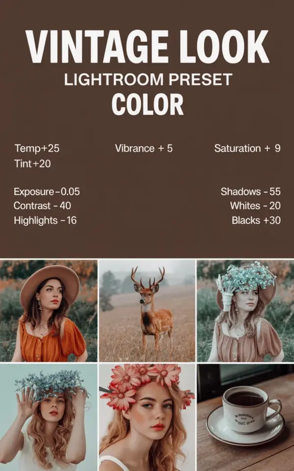
Let me break down the actual numbers behind this preset, because precision matters when you are trying to recreate classic film colors. The settings used in this preset are simple but effective. They are pulled straight from the Look Lightroom preset advertisement with the brown background and white text, and I have tested them on several types of photos. Here is what you get:
- Temperature: +25 (adds warmth, shifts the white balance toward golden and amber tones)
- Tint: +20 (pushes the green magenta balance toward magenta, which neutralizes the green cast typical of digital sensors)
- Exposure: -0.05 (a tiny pull to retain shadow detail and avoid blow outs)
- Contrast: -40 (dramatically softens the image, mimicking the lower contrast of vintage film)
- Highlights: -16 (tames bright areas, especially on skin or sky)
- Vibrance: +5 (boosts muted colors without oversaturating skin tones)
- Saturation: +9 (adds a subtle richness to the overall palette)
Notice the contrast is set to minus 40. That is a big move, and it is the secret to that flat, dreamy look you see in old vacation photos. The exposure is barely touched, just a hair down, because the preset wants to preserve detail while keeping the image bright. I find this balance perfect for photos taken in midday light
#VintageLook #LightroomPresets #FilmPresets #WarmTones #RetroPhotography
Leave a Comment