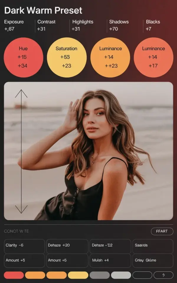
Scrolling through fall photo inspo at 11pm, you spot it: that dark warm preset look that makes pumpkins look cinematic and leaves feel like they’re glowing from the inside. The good news? It’s not locked behind a paywall or some guru’s secret formula. Every single setting for a cozy, moody autumn edit is right here, and it costs you exactly nothing to try.
Honestly, this preset is just shy of being famous. The exposure sits at -0.67, contrast climbs to +9, highlights drop to -31, shadows sink to -70, and blacks rest at -17. That combination alone gives you the dark, dusty, warm mood that screams “fall photo editing session.” The orange, yellow, and red tweaks below are what actually make it feel like autumn, not just a dim photo with a filter slapped on.
Dark Warm Preset Settings for Lightroom
Here’s the full recipe, no guessing required. Open Lightroom, import your photo, and plug these numbers in one by one. Keep them exact for your first try, then tweak once you see the result.
- Exposure: -0.67 (this drops the overall brightness)
- Contrast: +9 (gives the image a gentle, real-life push)
- Highlights: -31 (keeps bright autumn skies from blowing out)
- Shadows: -70 (the heavy hammer that creates the moody depth)
- Blacks: -17 (grounds the dark parts so they don’t look muddy)
That’s the base. Five sliders. No gimmicks. If you stop there, you’ll still get a decent result. But the color work is what makes this preset actually special.
Why These Fall Photo Editing Settings Create That Cozy Look
Look, there’s a reason so many autumn presets lean dark instead of bright. Bright, airy edits fight against the season’s natural palette. Dark warm presets lean into it. The -70 shadows are doing the heaviest lifting because they push the background back and let the orange and red in your subject pop forward.
Contrast at +9 is far from aggressive. It’s just enough to separate the leaves from the branches, the sweater from the background. Highlights at -31 stop the sky from becoming a white void. And honestly, that blacks slider at -17 is where the “expensive looking” part comes from. Too much black and your photo dies. Too little and it feels washed out. This number sits right in the middle.
How to Recreate This Preset in Lightroom Mobile for Free
You don’t need the paid version of Lightroom for this. The free mobile app has every single slider mentioned here. Import your photo, tap the adjustment panel, and start with exposure. Save it as a preset at the end so you can apply it to your whole fall album in two taps.
One warning though: the free version doesn’t let you save custom presets unless you create them as a “copies” workflow. So copy the photo you love, apply the settings, and export. Or just memorize the numbers. It’s four values, you’ll
Leave a Comment