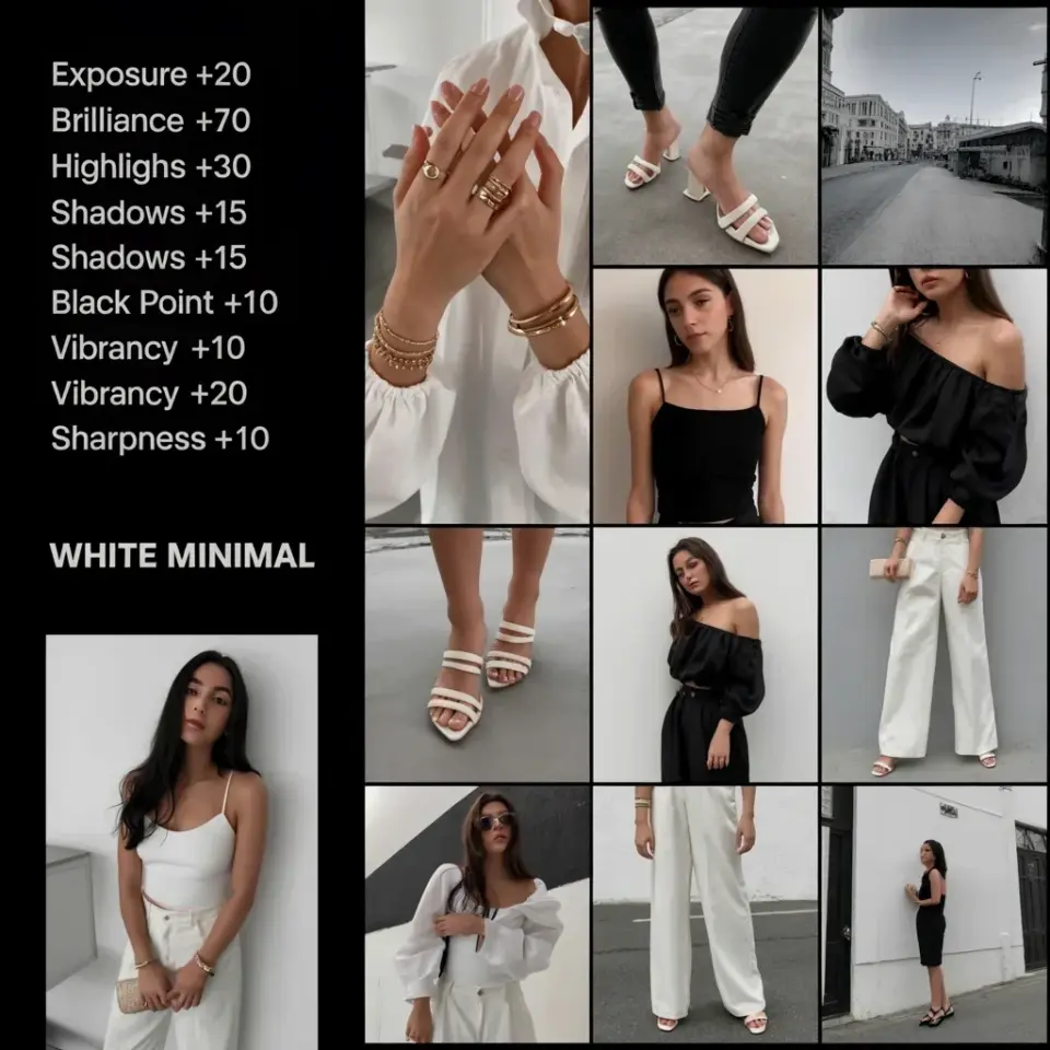
I still remember the first time I saw that dreamy whiteminimalfilter look on someone’s Instagram feed. Everything felt clean, airy, like the photo had been dusted with soft light. I immediately Googled presets and found packs for $15, $20, even $50. No thanks. So I spent a weekend in Lightroom tweaking sliders until I cracked the code. Here’s the thing: you don’t need to spend a cent. I’ll show you exactly how.
Recreating the white minimal filter with free Lightroom tools
Ok so, first things first. You need Lightroom, obviously. The free mobile version works fine, honestly. I use the desktop CC version because I’m old school, but the same sliders exist in both. The beauty of this method is that you don’t need any fancy tools. Just the basic sliders in the Develop module. And a bit of patience. Not gonna lie, the first few tries might look like a washed out mess. That’s normal. Stick with me.
I’m the kind of person who gets distracted by a weird shadow on a face. I’ll zoom in on the jawline and notice a patch of uneven exposure and then I’m off editing for twenty minutes just on that one spot. It’s a problem. But for the white minimal filter, you don’t need that level of micro-edit. Keep it broad. That’s the lesson I learned the hard way.
My favorite Lightroom free tips for a clean minimal edit
Here’s the thing I learned after ruining about ten photos. Start with a neutral photo. One that’s properly exposed already, not too dark, not too bright. If your photo is underexposed, you’ll fight the shadows. If it’s overexposed, you’ll blow out details. Aim for a balanced shot. Then apply these three adjustments in order.
- Exposure up by 0.5 to 1.0 stops. I usually go +0.7. This lifts the overall brightness without frying the highlights.
- Contrast down, way down. I often drop it by 20-30 points. This gives that soft, even look.
- Whites up moderately, maybe +15. This brings back some punch without harsh contrast.
That’s the skeleton. From there, you can adjust highlights and shadows to taste. And don’t forget to save your work as a preset so you never have to start from scratch again.
Budget photography editing why presets are overrated
Look, I get the appeal of presets. One click and done. But they lock you into someone else’s interpretation of white minimal. And they cost money. For the price of one preset pack, you could buy a used lens cap or something. Honestly, learning to edit manually gives you freedom. You can adapt the look to any lighting condition. A preset from a sunny beach won’t work in a dim café. But your own slider know-how will. That’s the real budget photography hack.
And here’s an odd little thing I noticed. Most paid presets just boost exposure, drop contrast, and push whites anyway. So you’re literally paying for something you can do in thirty seconds. Why? Because they package it with a pretty name and a fancy thumbnail. Don’t fall for it. Save that money for a nice memory card or a coffee.
How to build a consistent minimal style across photos
I have a weird habit of checking the histogram on every photo even if it looks fine, just to be sure. For a consistent minimal style, you need to match the tonal balance between shots. So after you dial in the white minimal filter on one image, save it as a preset. Yes, you can create your own custom preset for free. In Lightroom, just click the + icon in the Presets panel. Name it something like “White Minimal Free”. Then apply it to every photo. Then tweak each one individually because no two photos are exactly alike. But at least you have a starting point.
That’s the secret to building a cohesive feed. Not buying a pack. Building your own brand of minimal.
Oh and another thing: if you shoot in natural light, you’ll get more consistent results. Indoor tungsten lights mess with the white balance and make it harder to achieve that airy feel. Just a heads up.
Phototips three sliders that make the whiteminimalfilter magic
Ok so we covered exposure, contrast, whites. But there’s a fourth slider most people ignore: Dehaze. Bring it down slightly, like -5 or -10. It softens the image further, mimicking that dreamy haze you see in expensive presets. I discovered this on accident when I was trying to fix a foggy morning shot. Now I use it every time.
Another slider: Texture. Don’t touch it for the white minimal look. Actually, you might want to lower it by 5 points if the photo feels too sharp. But be careful, you don’t want it to look plastic. Just a hint of softening.
And then there’s Clarity. I leave it alone or sometimes lower it by 5. Too much clarity destroys the minimal vibe. Trust me, I’ve gone down that rabbit hole.
Adjusting exposure and contrast like a minimal style pro
Let’s get specific. Exposure
#whiteminimalfilter #lightroomfreetips #budgetphotography #minimalstyle #phototips
Leave a Comment