Skip to content
Dark Warm Preset Common Mistake - Don't Skip These HSL Settings

Dark Warm Preset Common Mistake – Don’t Skip These HSL Settings

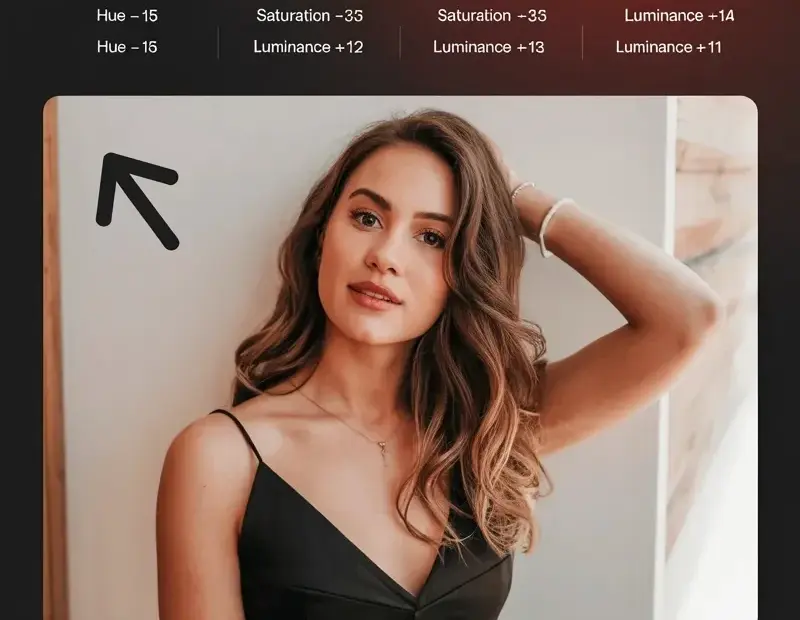
This dark warm preset guide shows the exact settings for a moody edit: exposure -0.67, contrast +9, shadows -70. The biggest mistake? Skipping the HSL panel – these hue and saturation values for red, yellow, and orange are what give it that deep, warm tone. Save this for your next Lightroom session! 📸 #DarkWarmPreset #LightroomSettings #PhotographyEditing #PresetGuide #LightroomPresets
Want That Dark Warm Preset Look? Every Setting Is Right Here

Want That Dark Warm Preset Look? Every Setting Is Right Here

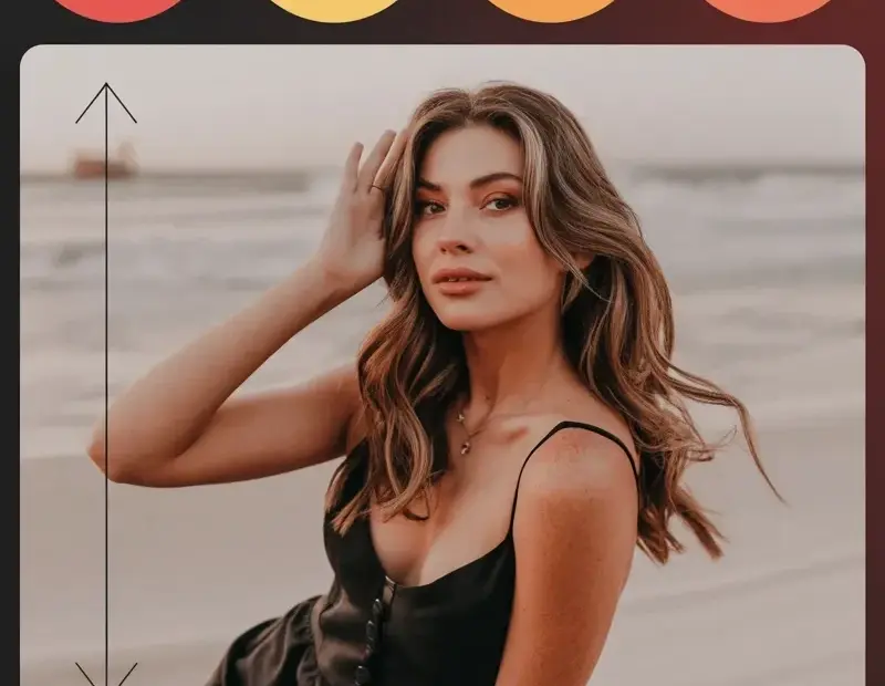
This dark warm preset is perfect for cozy fall photos – exposure -0.67, contrast +9, and shadows at -70 give that moody autumn look. Plus the orange, yellow, and red color tweaks are right there in the pic if you wanna recreate it. Save this for your next editing session 🍂

Dark Warm Preset Settings: Lightroom Exposure & Color Hue Guide

Dark Warm Preset Settings: Lightroom Exposure & Color Hue Guide

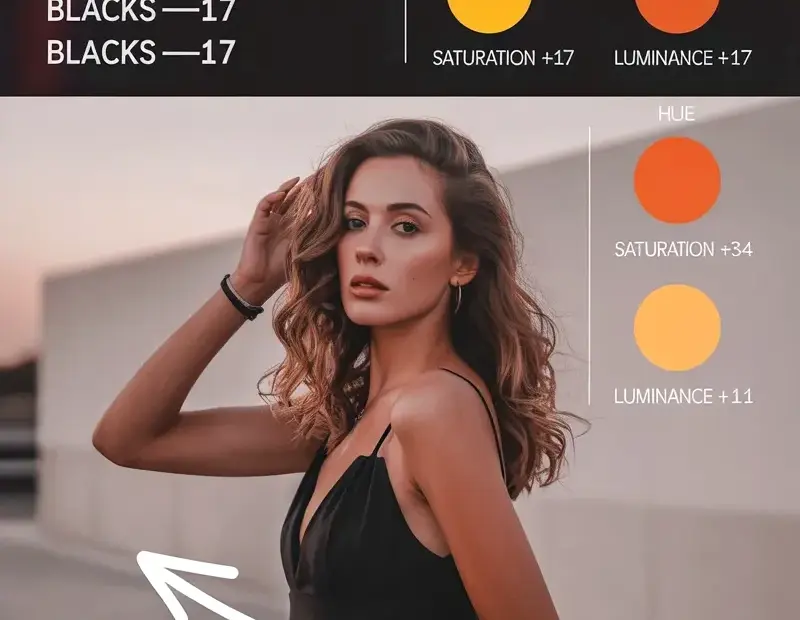
This dark warm preset guide shows the exact exposure and color adjustments for a moody edit. With exposure -0.67, contrast +9, shadows -70, and blacks -17, plus red, orange, and yellow hue/saturation tweaks. Perfect for photographers wanting a warm, dramatic look. Save this for your next editing session. #DarkWarmPreset #LightroomPreset #PresetGuide #EditingTips #PhotographyTutorial
